Flourish
Empowering chronic illness patients to take control of their health and stay focused on the bright side.
CHALLENGE
Flourish was my capstone project for the Senior Design Challenge, a course that offers Dartmouth seniors the chance to tackle real-world problems.
Our community partner Ari presented my team with a challenge: design a way for patients with multi-symptom chronic illnesses to better track and visualize their symptoms, triggers, and treatments.
OUTCOME
- We interviewed 46 patients and providers as initial primary research
- We created 80+ Figma screens and a full clickable prototype
- We conducted 19 hours of user testing and four rounds of iteration.
- After our final presentation, the DALI Lab volunteered to take Flourish on as a pro-bono project. It is currently under development.
PROJECT INFO
Team
Me (designer)
Carson Levine (designer)
Mira Ram (designer)
Sia Peng (designer)
Skills
User research
Wireframing & rapid iteration
User testing
Figma prototyping
Timeline
5 months (2019-2020)
BACKGROUND
Chronic illness is on the rise, and doctors are struggling to understand it
Some doctors have noticed a “silent epidemic” of chronic illness that, for reasons that are unclear, is affecting mostly young people who are women or AFAB.
- Ehlers-Danlos Syndrome
- Myalgic Encephalomyelitis
- Fibromyalgia
- POTS
- Chronic Lyme
Many of the patients we talked to were diagnosed with multiple of these illnesses (comorbidity is very common), and can have a wide range of symptoms even within the same diagnosis.
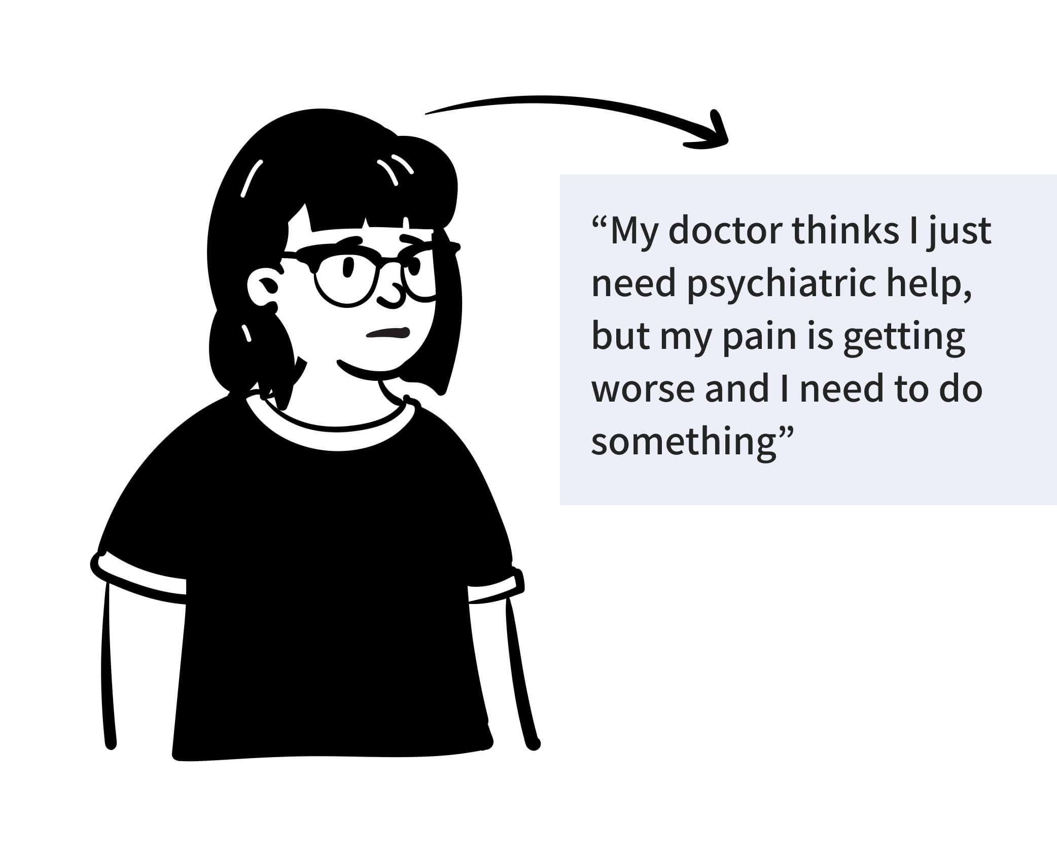
Meet Robin
- 23 year old college student who recently had to take medical leave from school
- They have had chronic symptoms since primary school, but weren’t diagnosed with Ehlers-Danlos Symdrome (EDS) and Mast Cell Activation Syndrome (MCAS) until last year.
- Symptoms are getting more active but their doctor thinks it’s in their head
- They’re trying to figure out the best lifestyle for their conditions, and has been sporadically tracking their diet and activities in an Excel spreadsheet
THE CHALLENGE
How might we empower chronic illness patients, like Robin, to take control of their health?
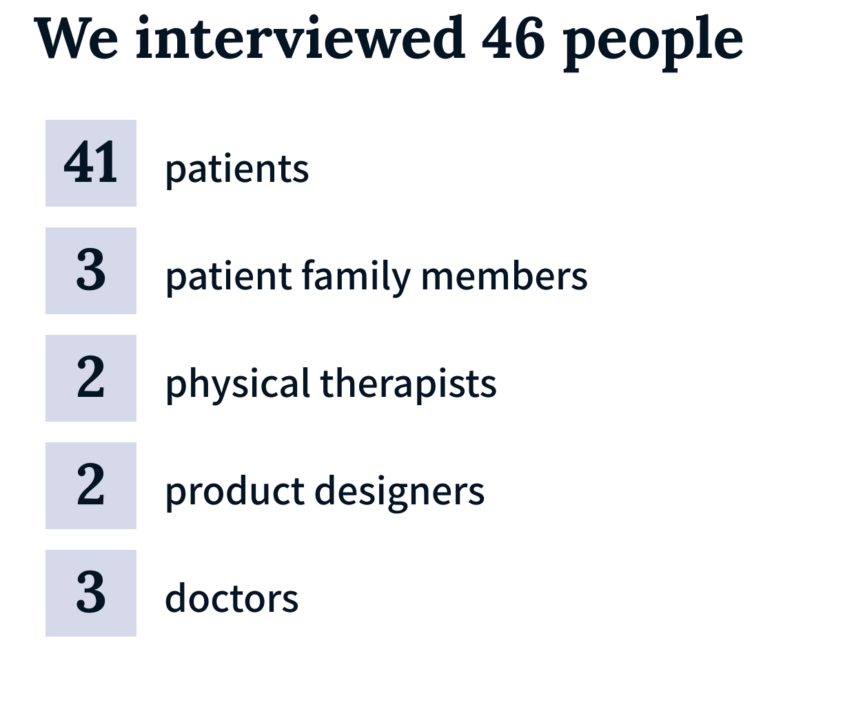
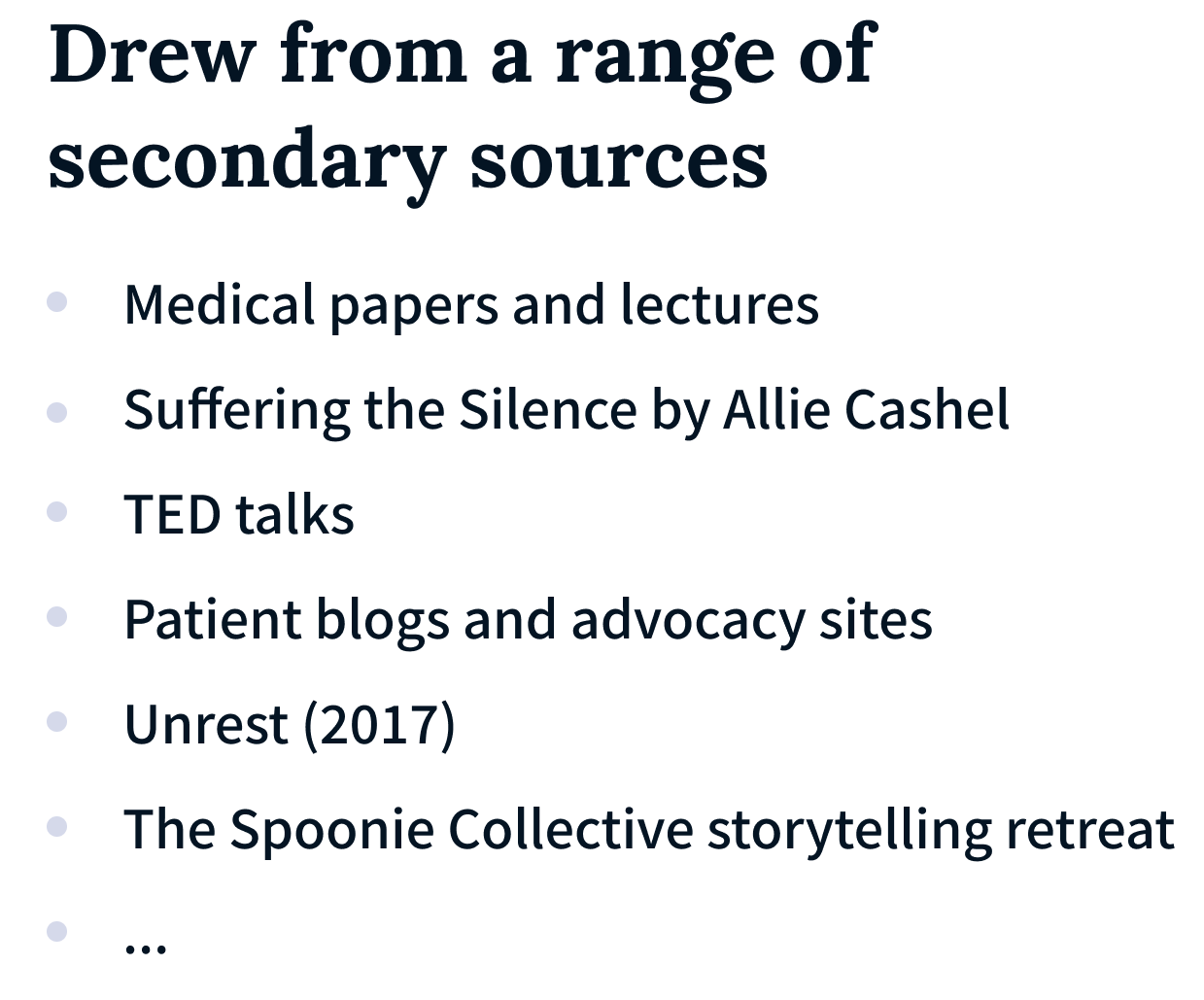
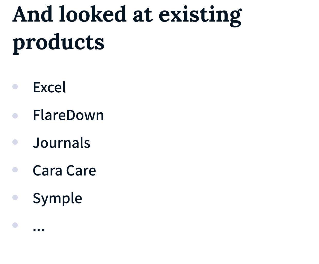
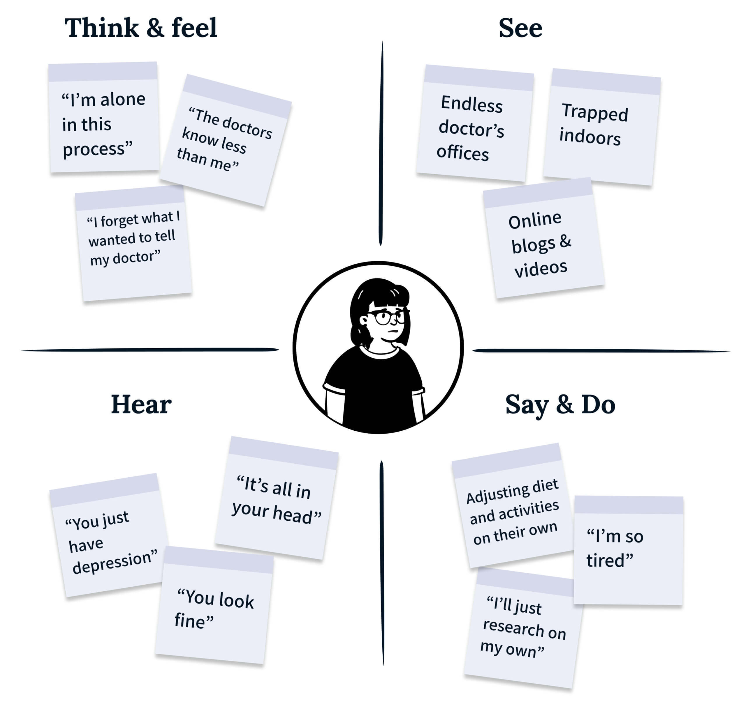
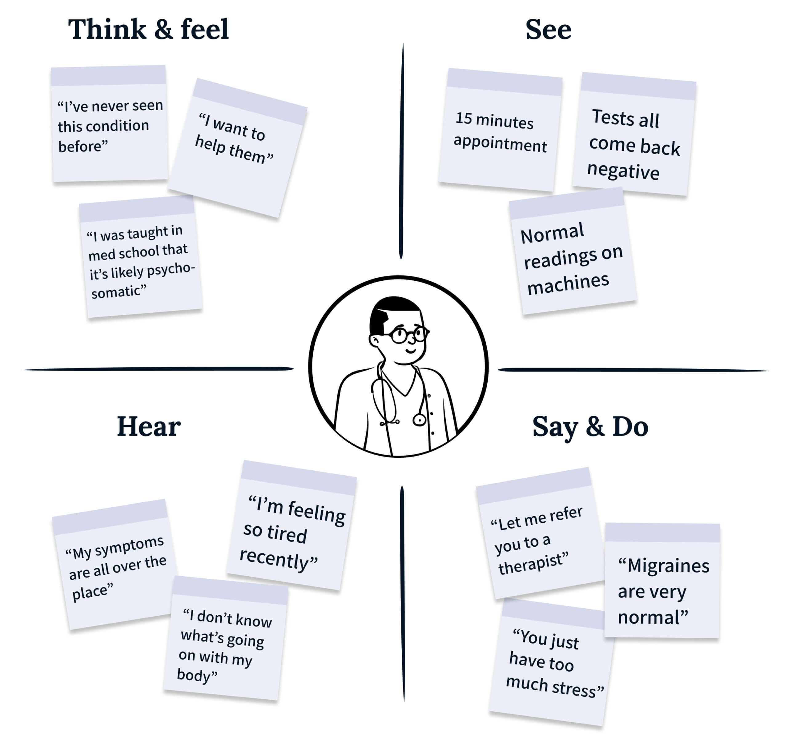
Hearing stories from patients and doctors helped us map the surrounding ecosystem and empathize with both sides.
DESIGN PRINCIPLES
#1
Customizable to different patient profiles
Our first question was “which chronic illness should we design for?” But our research quickly showed us that “choosing” an illness simply would not work. Most of the people we talked to were actually diagnosed with multiple conditions, and even those with different diagnoses could experience similar symptoms and triggers. At the same time, variation even within one condition can be infinite. From the outset, we knew customizability would be key.
“The way I experience Crohn’s may not be how someone else experiences it. You have to give people the space for flexibility or it won’t work for anyone.”
-Patient LM
#2
Use data to aid doctor-patient communication
We heard so many stories from patients who have had their pain diminished, told by doctors that they simply need psychiatric help. Many have turned away from Western medicine as a result. But talking with doctors showed us that they are being pushed to see more patients and diagnose faster. They’re not trying to be dismissive, they’re just following their training.
One bright spot? Data. It can convince doctors that a patient’s symptoms are real and help them formulate plans for moving forward. Numbers can translate qualitative symptoms into a language both doctors and patients understand
“My doctor only believed me when he noticed the extreme heart rate on the machine... That data speaks more than saying 'I'm so tired'"
-Patient CN
#3
As quick to use as possible, and perhaps even delightful
The mental and physical burden of tracking symptoms can be overwhelming. It reminds patients of their pain, and can take energy that they simply don’t have. We wanted our solution to fit seamlessly into their lives and take some of the burden off of them wherever possible.
Adding an element of delight could also make tracking feel like less of a chore and help patients stay motivated. When combined with ease of use, perhaps we could turn symptom tracking into a positive experience.
"Sometimes I can't even get out of bed. How would I go to work on my computer and use Excel?"
-Patient CN
Ideation guided by accessibility and practicality lead to a focus on digital solutions
We wanted our solution to reach as many people as possible as well as take advantage of data analytics, so we knew that most practical options would be in the digital realm. And since our users often record their symptoms multiple times as they change throughout the day, they told us that the on-the-go convenience of a mobile application is particularly suitable for their needs.
While we certainly explored other directions, much of our brainstorming was dedicated to the potential features of a mobile app. Through the sketches pictured here, I quickly explored many different concepts for layout and functionality.
DESIGN CHALLENGE 1
Tracking and analytics
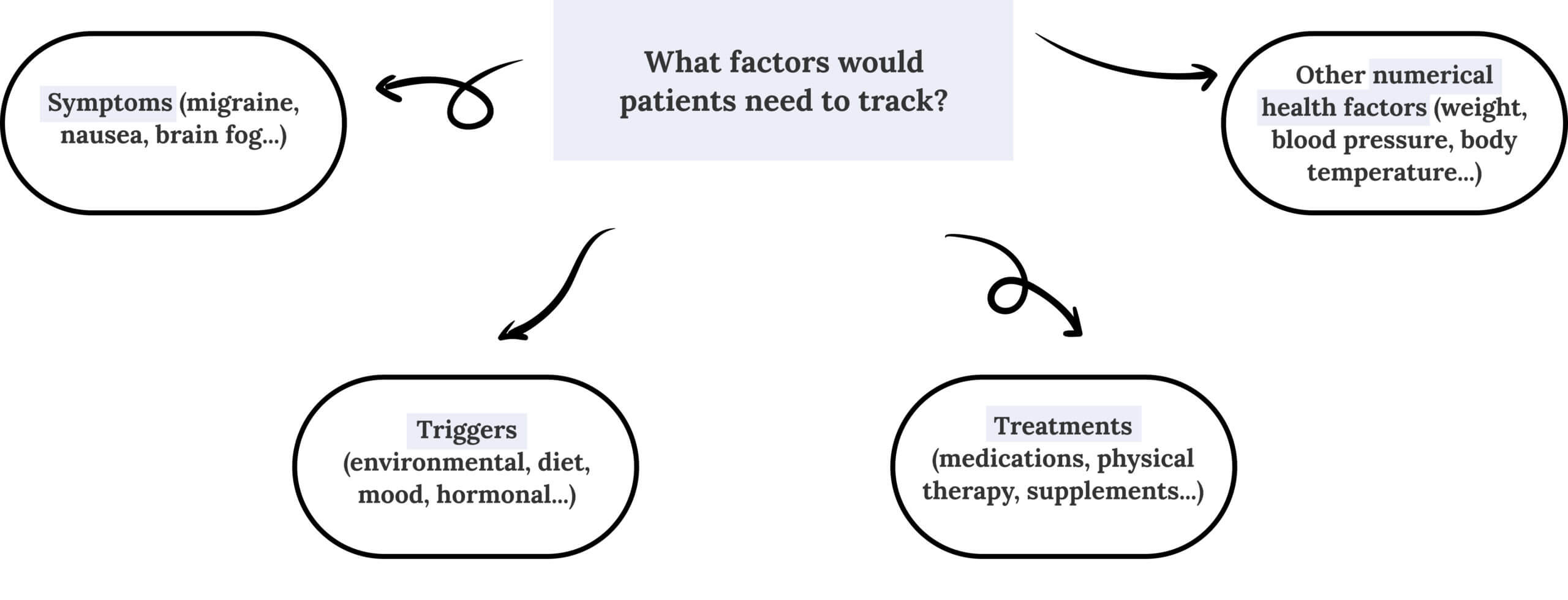
In the early stages of prototyping, I was focused on organizing the user flow for tracking health factors. Different modes of tracking would affect the level of detail captured, the time to track, as well as data visualization. First, I organized the types of health factors mentioned by interviewees into 4 broad categories to think about information architecture.
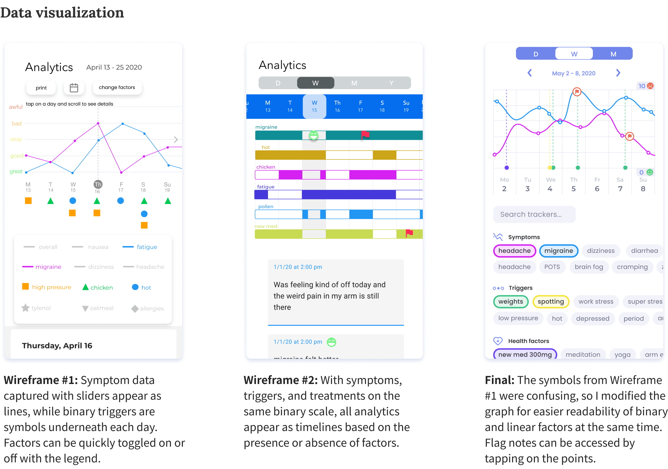
Nailing the UX of symptom and trigger tracking was particularly important, since any change could hugely impact the data visualization. I created multiple wireframes and brought them to both doctors and patients for A/B testing before creating final screens (thanks to help with styling from Mira). Click through to see iterations.
DESIGN CHALLENGE 2
Introducing customization
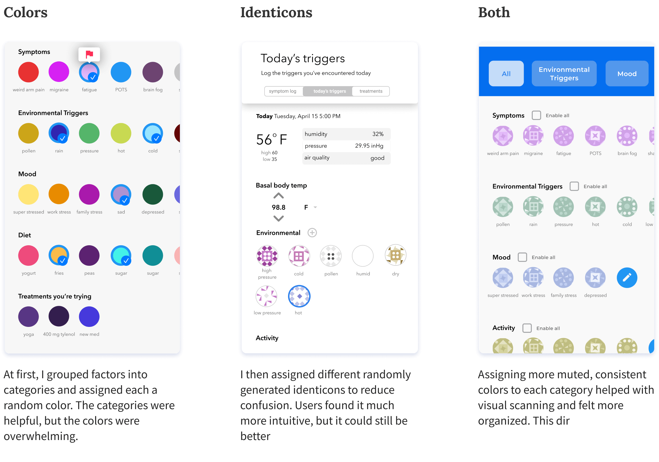
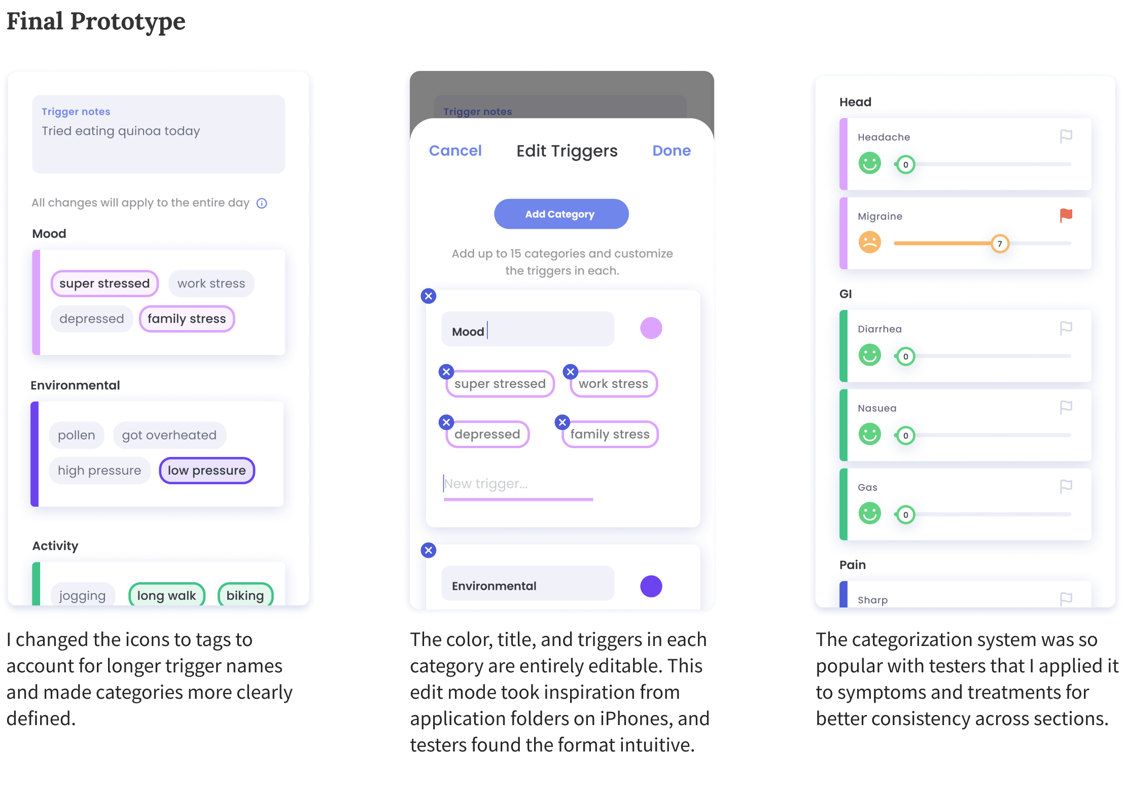
We heard from patients with triggers ranging from scented trash bags to artificial coffee, meaning that we could never limit users to a predetermined database of factors. But long lists of niche and varied factors could quickly get out of hand... How could we keep our users from feeling overwhelmed?
Focusing on the triggers section to start, I realized that categorization and color-coordination would be key for a more organized feel. User testing revealed that I needed to trust patients with even more control, enabling them to create custom categories as well as custom triggers. The flexibility of these modular categories enabled me to incorporate them into other sections as well.
DESIGN CHALLENGE 3
Motivation and delight
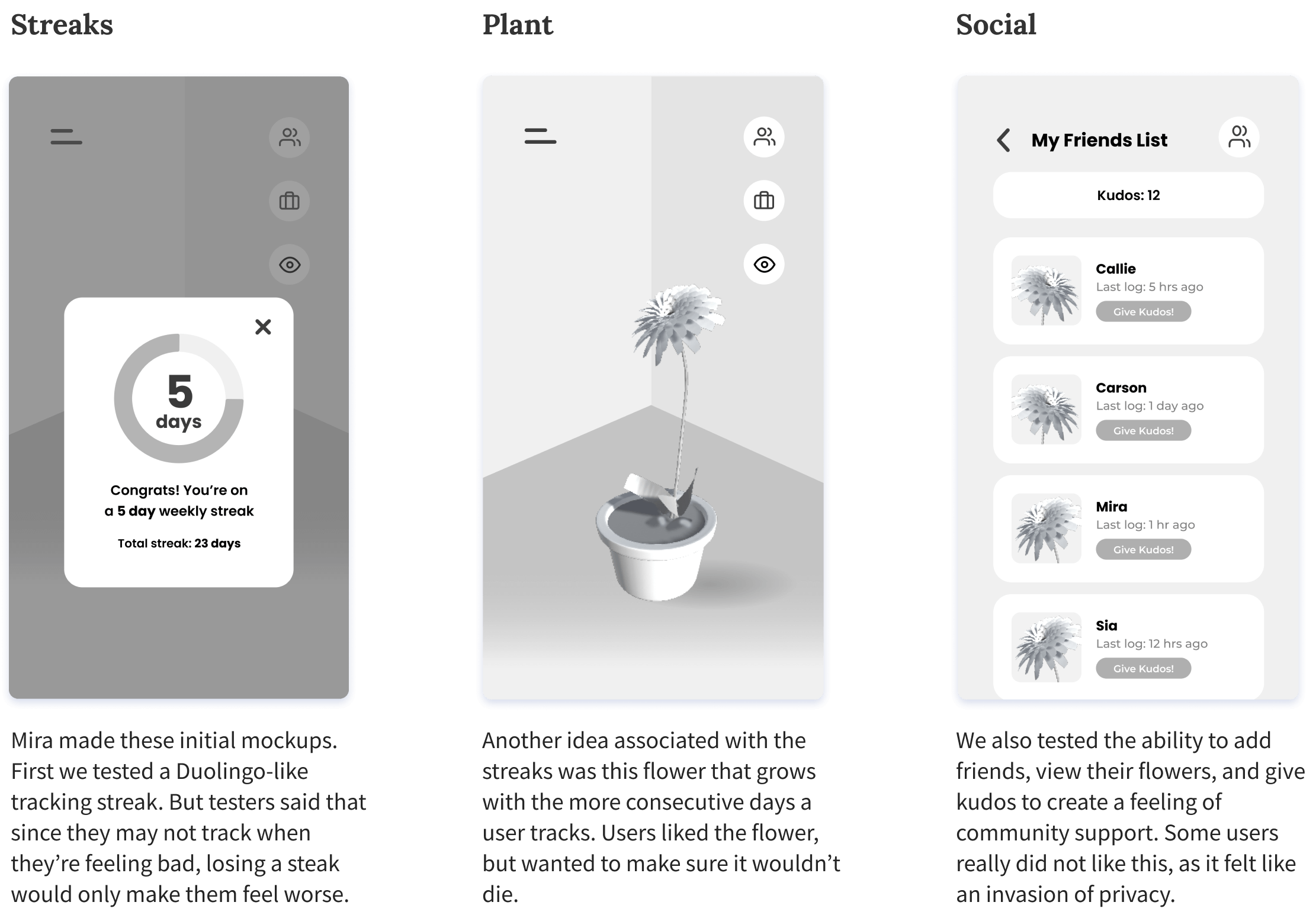
Besides a superior tracking experience and informative data, what would motivate users to keep coming back? So many patients had tried and failed to keep up with tracking; clearly, getting their data was not enough to justify the time and effort. We could see value being added through gamification, community support, mindfulness, etc. But would our users actually be receptive to this?
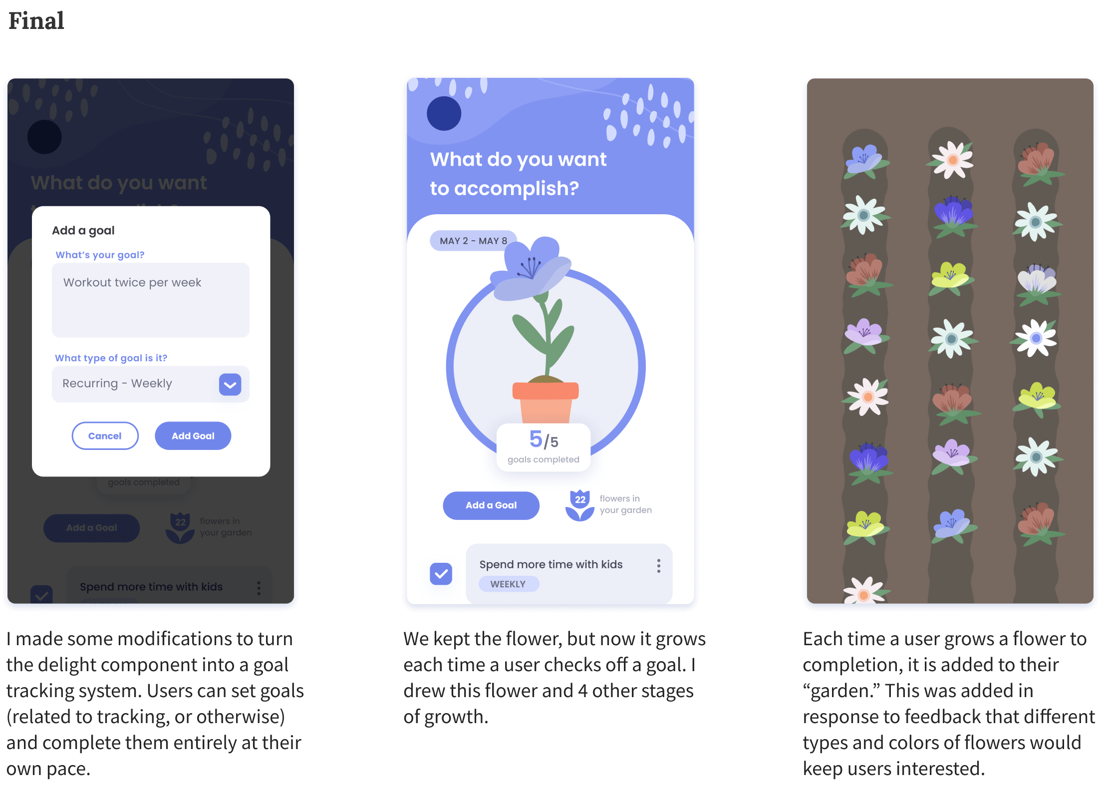
"This is not a social networking app" was one of my favorite pieces of feedback, from a user who helped us realize that a social component is not appropriate for a medical app. It led us to pivot to a focus on mindfulness and internal fulfillment, translating our idea of “cultivating” your own flower over time into a goal-based system.
FINAL SOLUTION
How can Flourish help?
Let’s check back in with Robin to see how they might use Flourish to manage their health.
Track
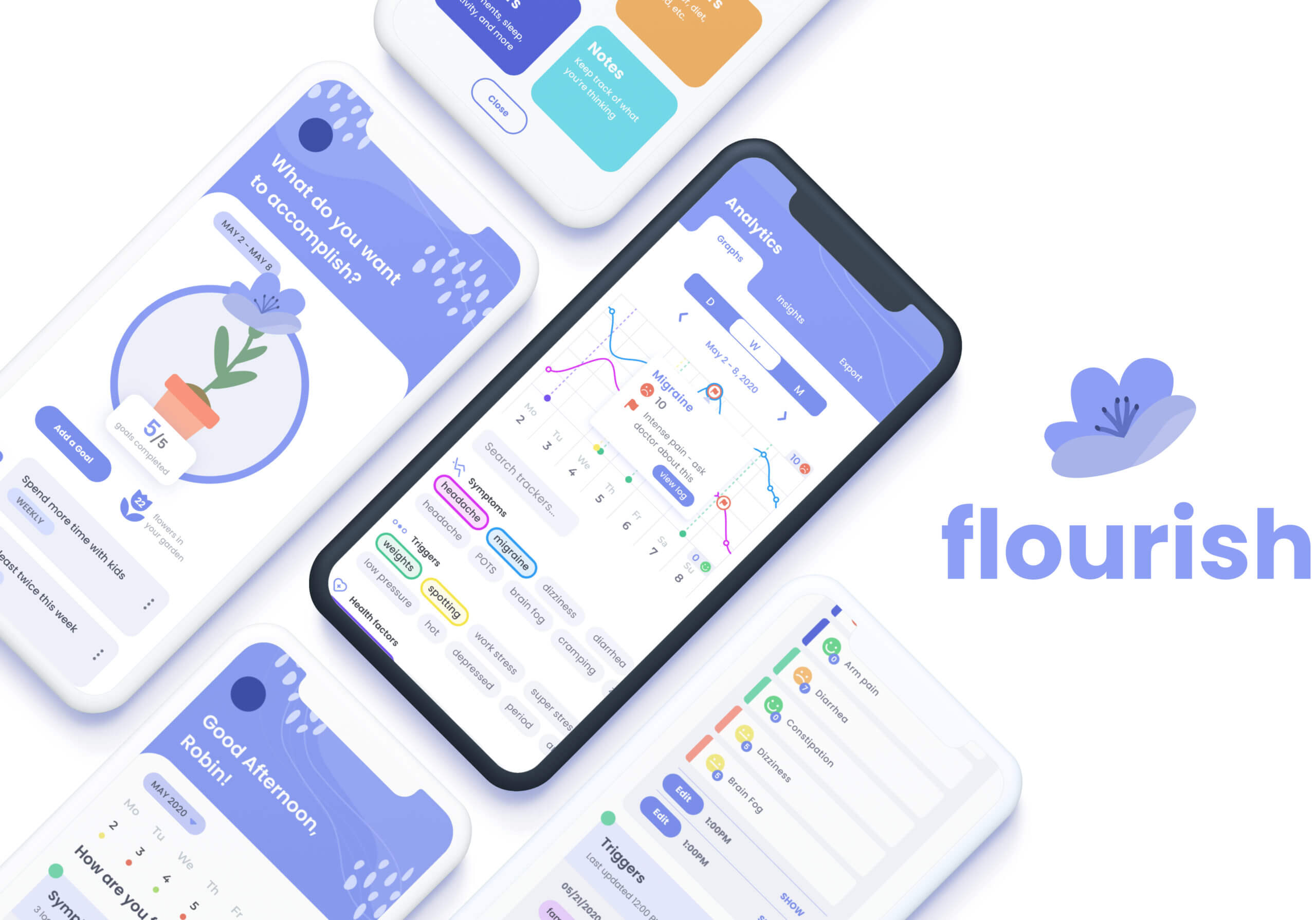
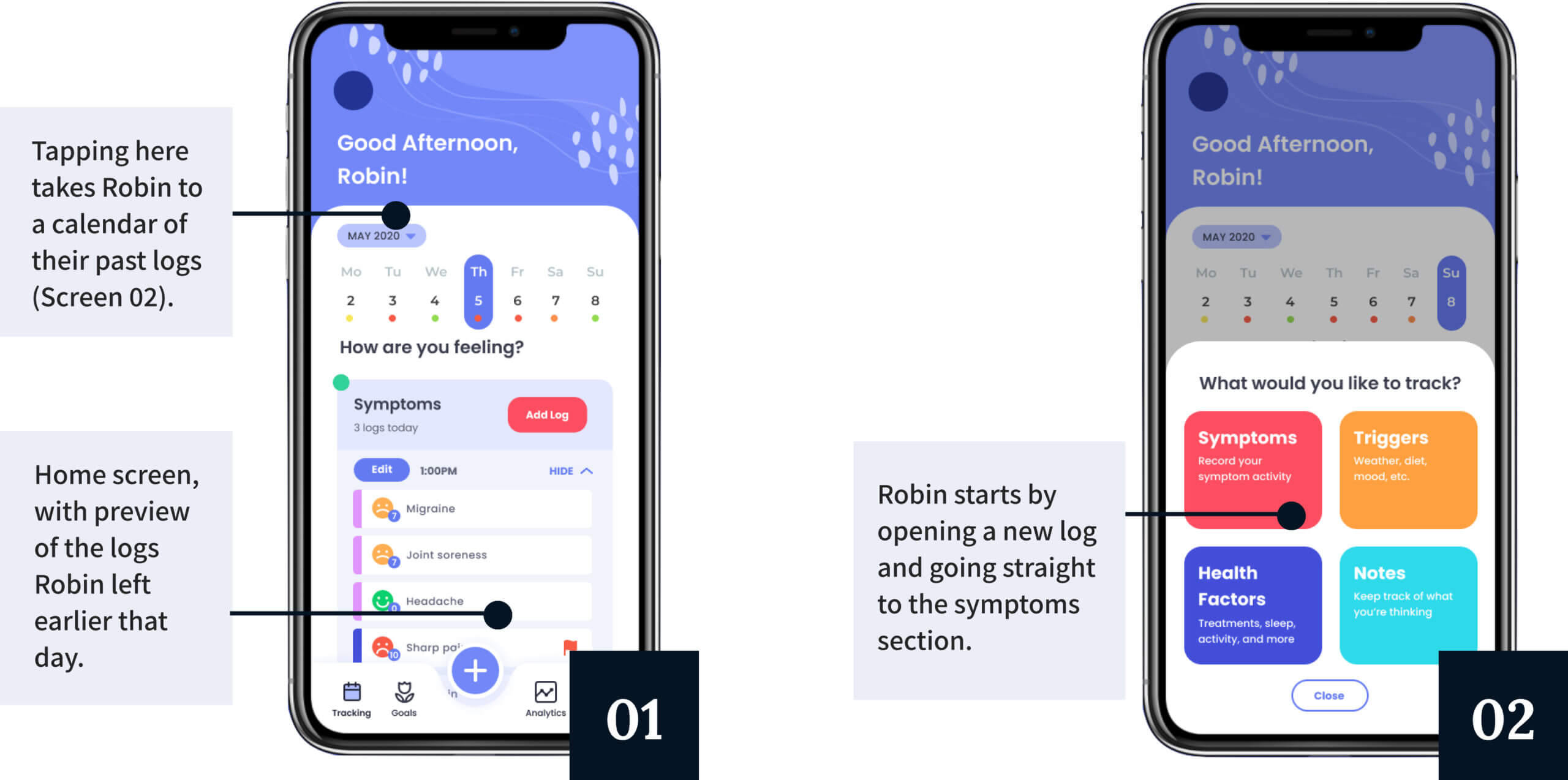
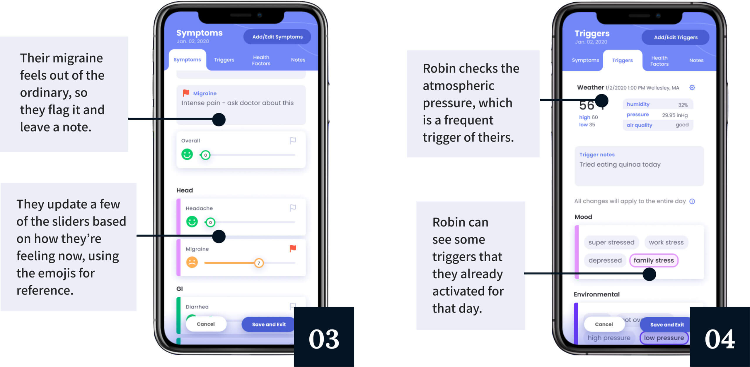
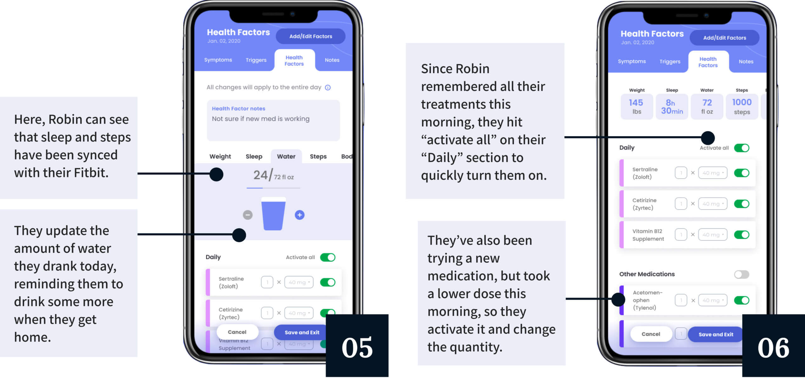
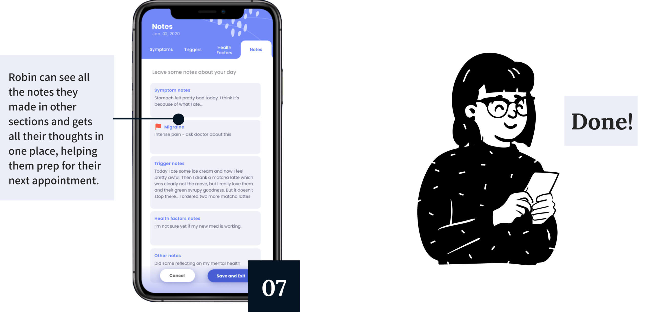
Tracking is split into four main categories: Symptoms, Triggers, Health Factors, and Notes. These categories exist as a loose framework that capture different types of data, but are all entirely customizable based on the individual preferences of the user. There is no umbrella structure that will work for all patients, meaning that Flourish guides, rather than dictates, how users can track.
Analyze & Communicate
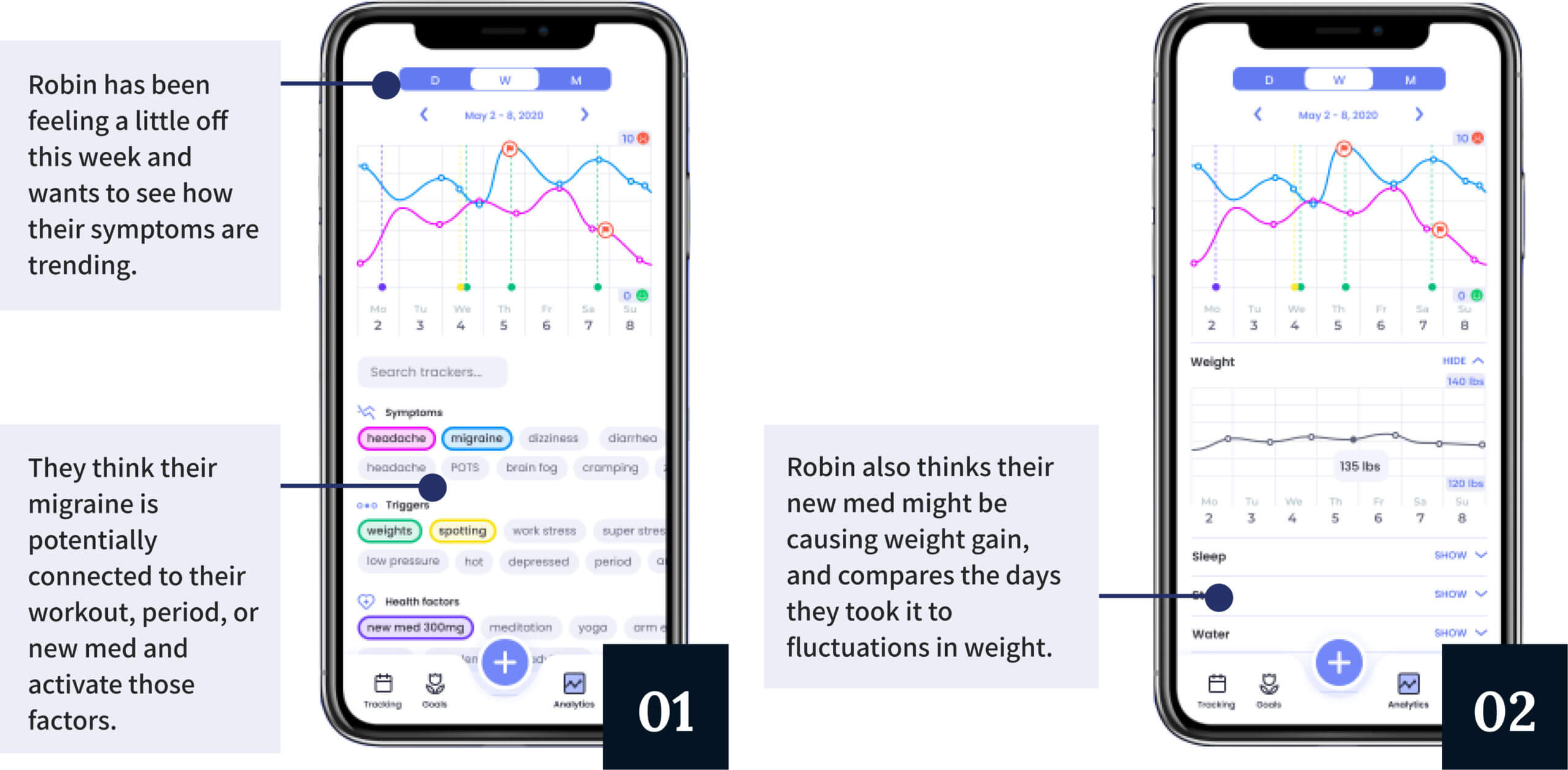
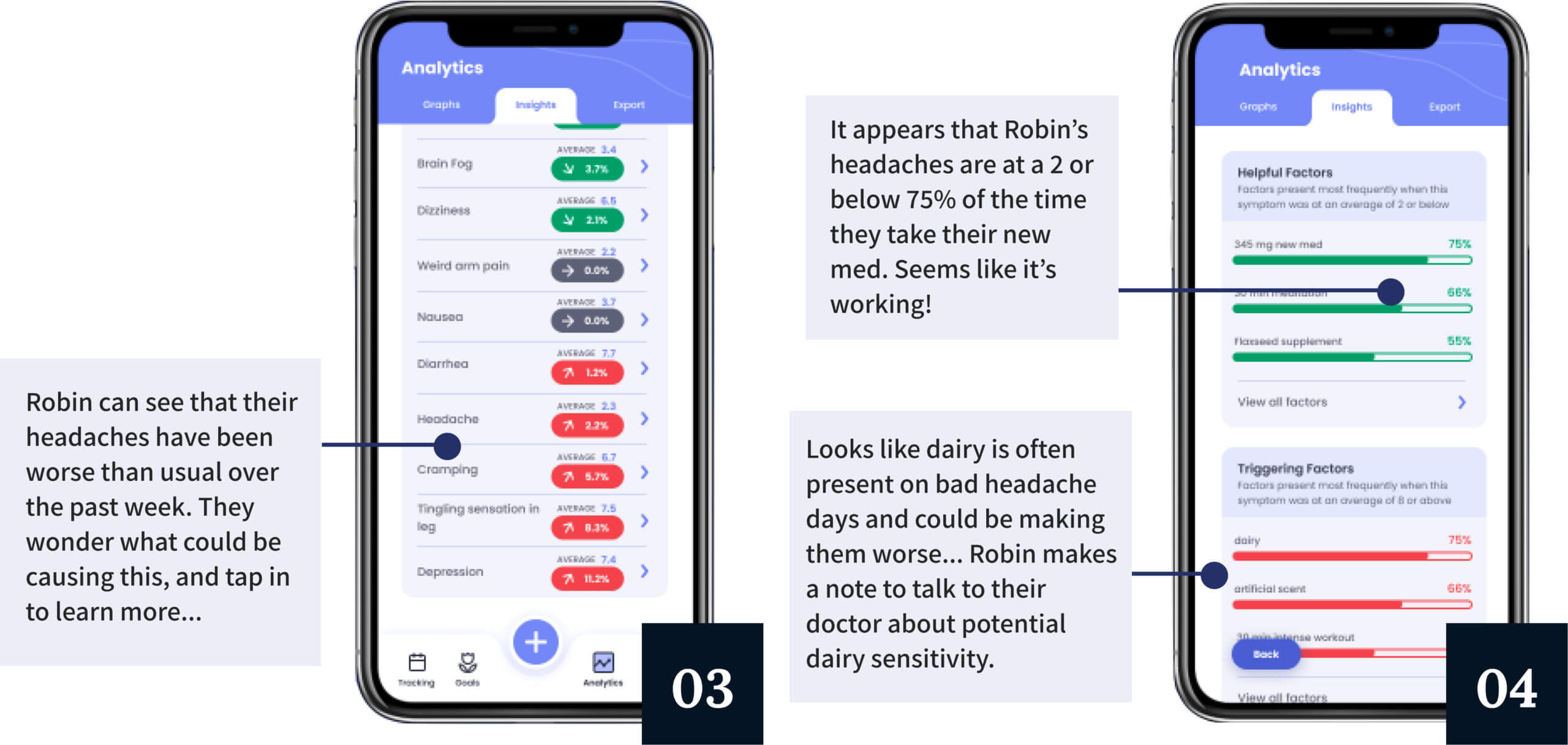
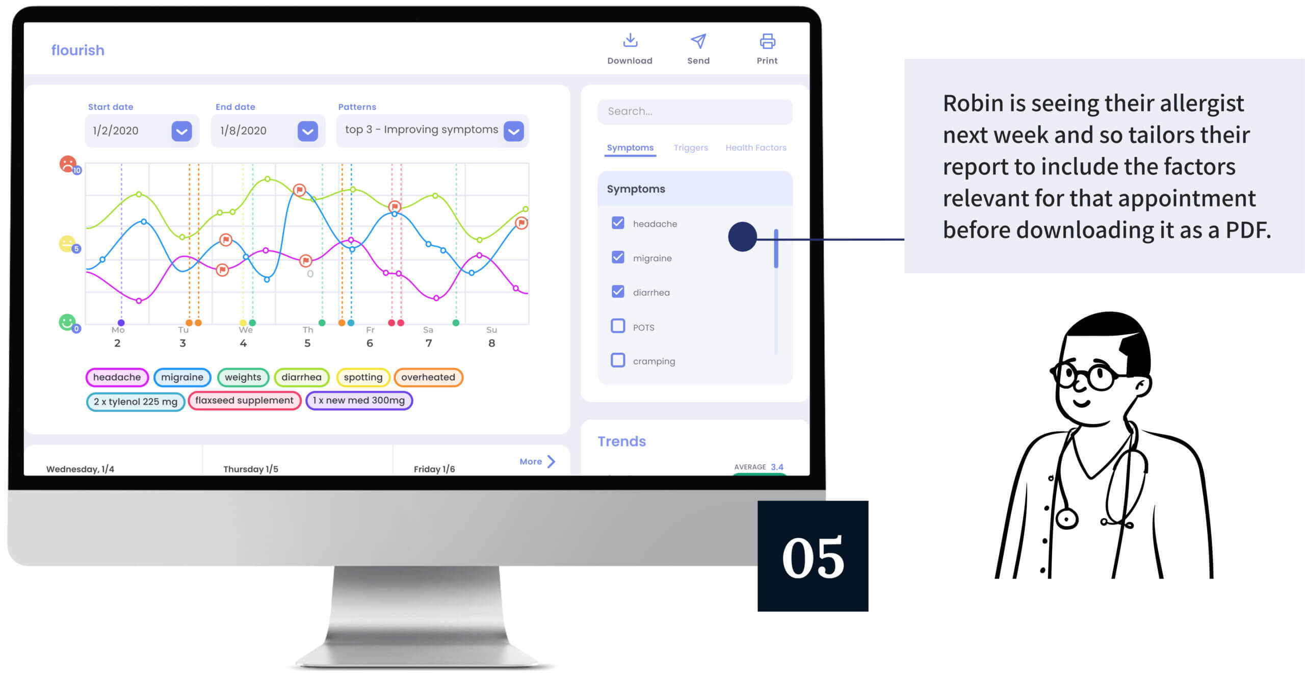
Flourish doesn’t just help patients display their data - it also helps them understand and communicate insights about their health. Simple but powerful graphs, symptom trends, trigger correlations, and reports for doctors all ensure that the data they spent time and energy tracking is worthwhile.
Grow
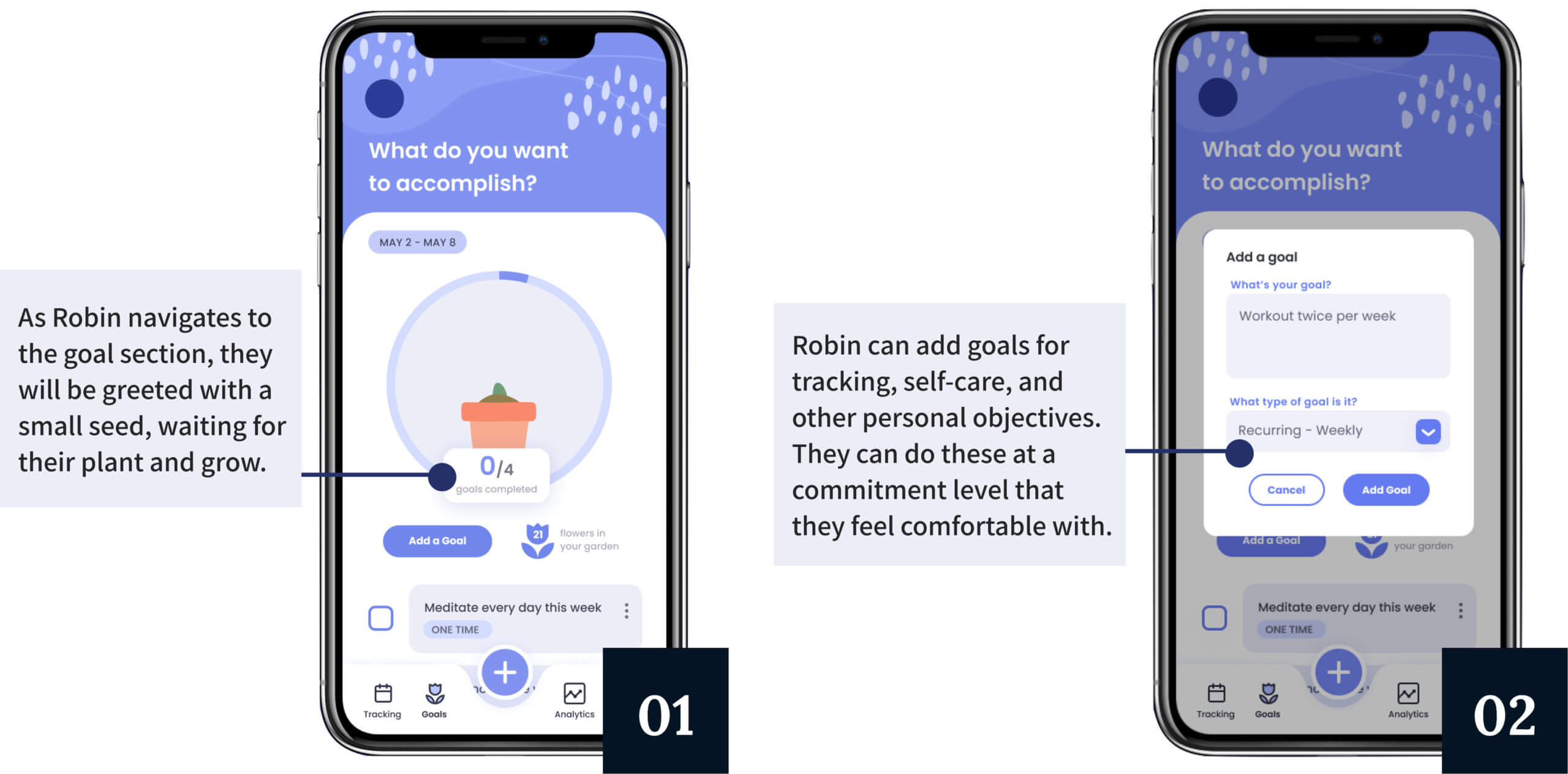
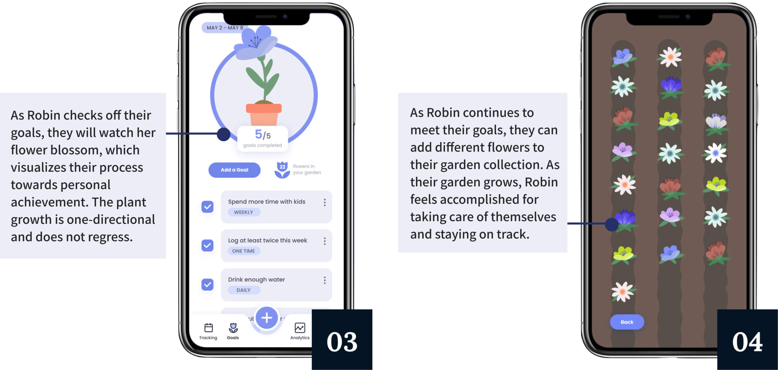
Tracking can be physically and emotionally taxing. Flourish brings delight to this draining process and promotes personal growth by enabling users to set goals for themselves. Completing goals at their own pace will cause a flower to grow, and users can look back in their garden to feel accomplishment and hope.
VIDEO WALKTHROUGH
USER FEEDBACK
TAKEAWAYS & NEXT STEPS
#1
Refine and implement
We are planning to partner with the DALI Lab in Fall 2020 through a social impact grant to begin developing Flourish. Our prototype is a good place to begin, but of course the design process should be ongoing. We hope to consult with devs to make Flourish feasible and sustainable for our partners, and also continue user testing to further improve Flourish.
#2
Tackling a complex system
At first, I was totally overwhelmed by the complexities of the patient journey and healthcare system. With such a huge range of experiences and so many interconnecting pieces, relying on many data analysis methods (empathy maps, journey maps, personas, etc.) was key to breaking down the problem.
#3
The users know best
It was easy for me to project my own assumptions into our solution and make what I thought would work. But as someone without direct experience with chronic illness, I had to continually remind myself that our users are the experts. Not getting attached to any ideas helped us to pivot when needed and ensured that these patients were finally being heard.
#4
Hard and soft skills
I led the majority of feedback sessions, and learning how to communicate with users effectively was probably the most crucial soft skill I gained from this project. Knowing when to jump in and when to let the users talk helped us make the most of our interviews and extract honest opinions. I also learned so much about visual design, Figma prototyping, and creating presentations from my professor and awesome teammates - the Senior Design Challenge helped me grow as a designer more than any other experience at Dartmouth.

NCSECU StorefrontUX/UI • Client work

TD WealthUX/UI • Client work
Magellan EAP AppUX/UI • Client work
GoPhishUX/UI • Student work
The Imagination StationExperience design • Student work

RescanoeProduct design • Student work
UnioUX/UI • Student work
