TD Wealth
Attracting users to TD Bank's automated personal investing platform
CHALLENGE
TD Bank was seeing a majority of users fail to complete the registration process for their new investing platform, and wanted to revamp the onboarding UX. We looked into the existing flow to identify barriers and areas for improvement within the technical constraints of their third-party software partner.
OUTCOME
- We designed a complete new onboarding flow optimized for both desktop and mobile
- I created a Figma design kit with universal styles and components
- We facilitated conversations with the development partners and I wrote user stories for a successful deployment of the new flow
PROJECT INFO
Team
Me (UX + visual design)
Andrew Klein (UX + visual design)
Chōkdee Rutirasiri (solutions lead + client experience)
Carly Riling (project manager)
Skills
Client collaboration
Wireframing & rapid iteration
Visual design
Design system creation
Timeline
3 months (2022)
END RESULT
Final mobile app prototype
I created these high-fidelity designs and prototyped them in Figma to faciliate communication with Magellan stakeholders and technologists. The MVP generated positive feedback and Magellan is taking the next steps towards development.
Updated landing page
The landing page more clearly outlines the benfits of TD Wealth's investing plaform and sets expectations for the registration process
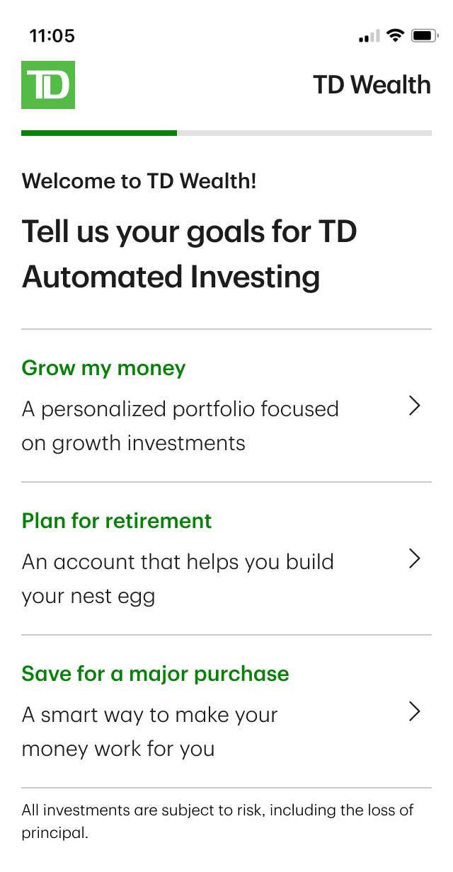
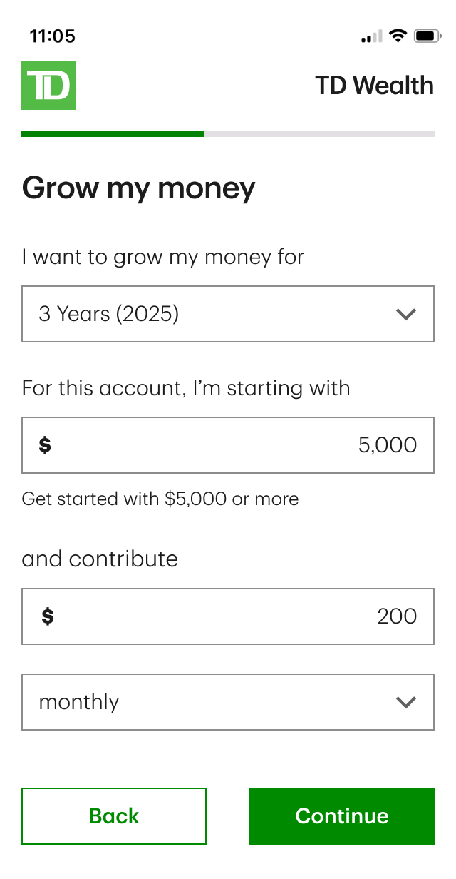
Personalization survey
These surveys help simplify the complicated backend calculations that go into creating a personalized investment portfolio. We wanted it to feel customized to their needs, but included the fewest possible questions to streamline the process.
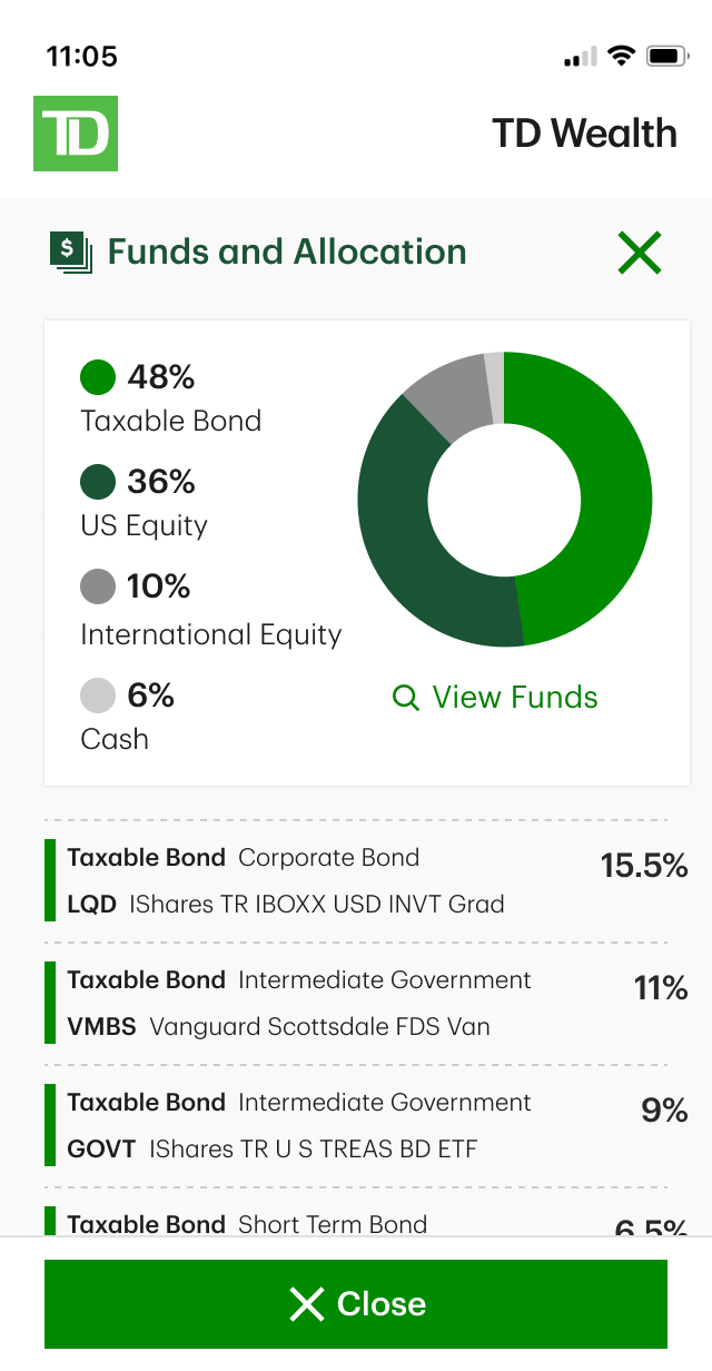
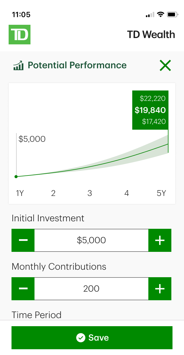
Adjustable portfolios
I helped iterate on these portfolio visualizations that enable the user to understand and adjust their investments in a more digestable format.
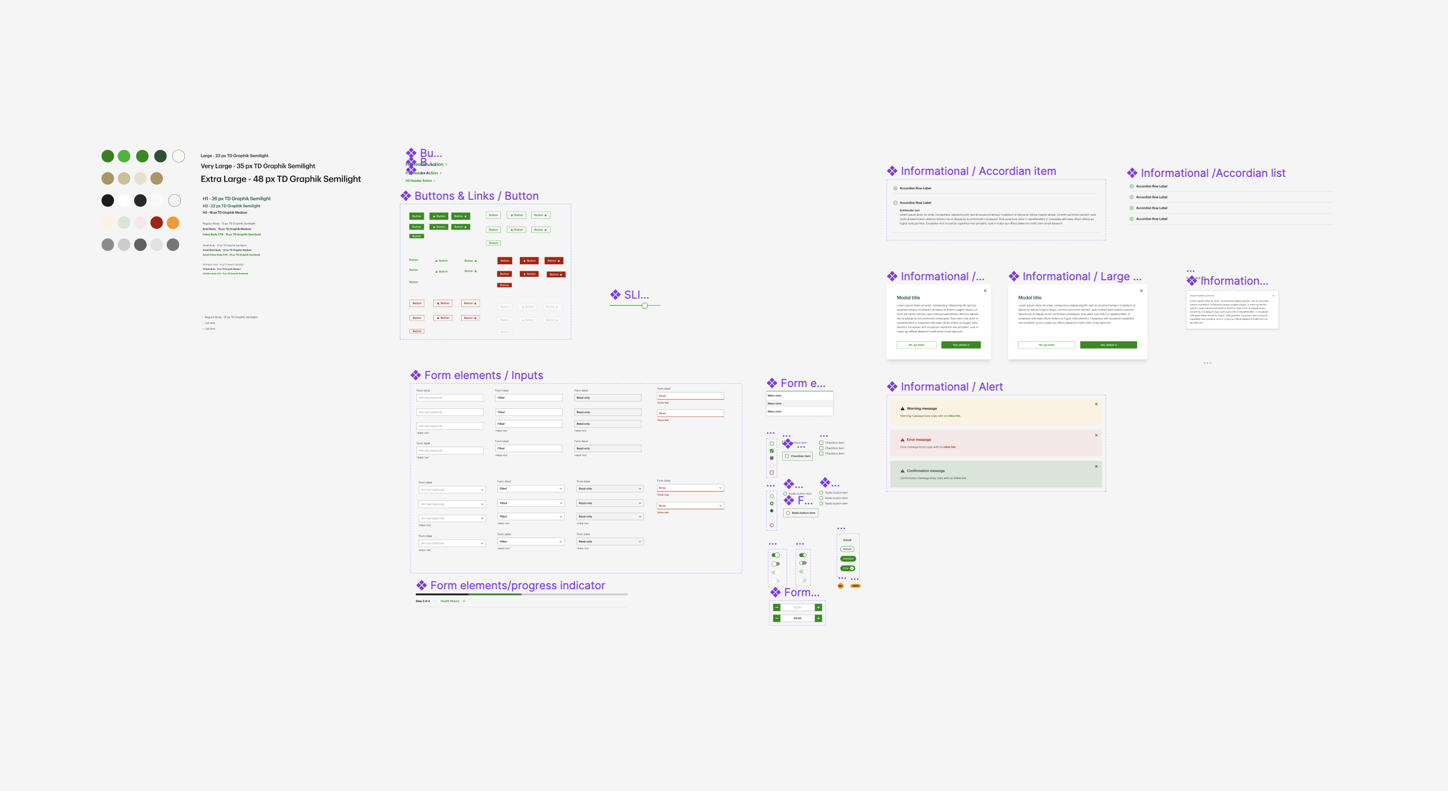
Design kit with styles and responsive components
I made sure to maintain an organized design system that would serve as the source of truth for spacing, colors, typography, and repeated components. With so many people collaborating on this project, it proved to be absolutely essential.
When Marketing requested that a style be tweaked or new copy came in from the content strategists, I could make changes that would flow across all 74 screens. We could also build mobile layouts almost instantly with component variants.
NCSECU StorefrontUX/UI • Client work
FlourishUX/UI • Student work
Magellan EAP AppUX/UI • Client work
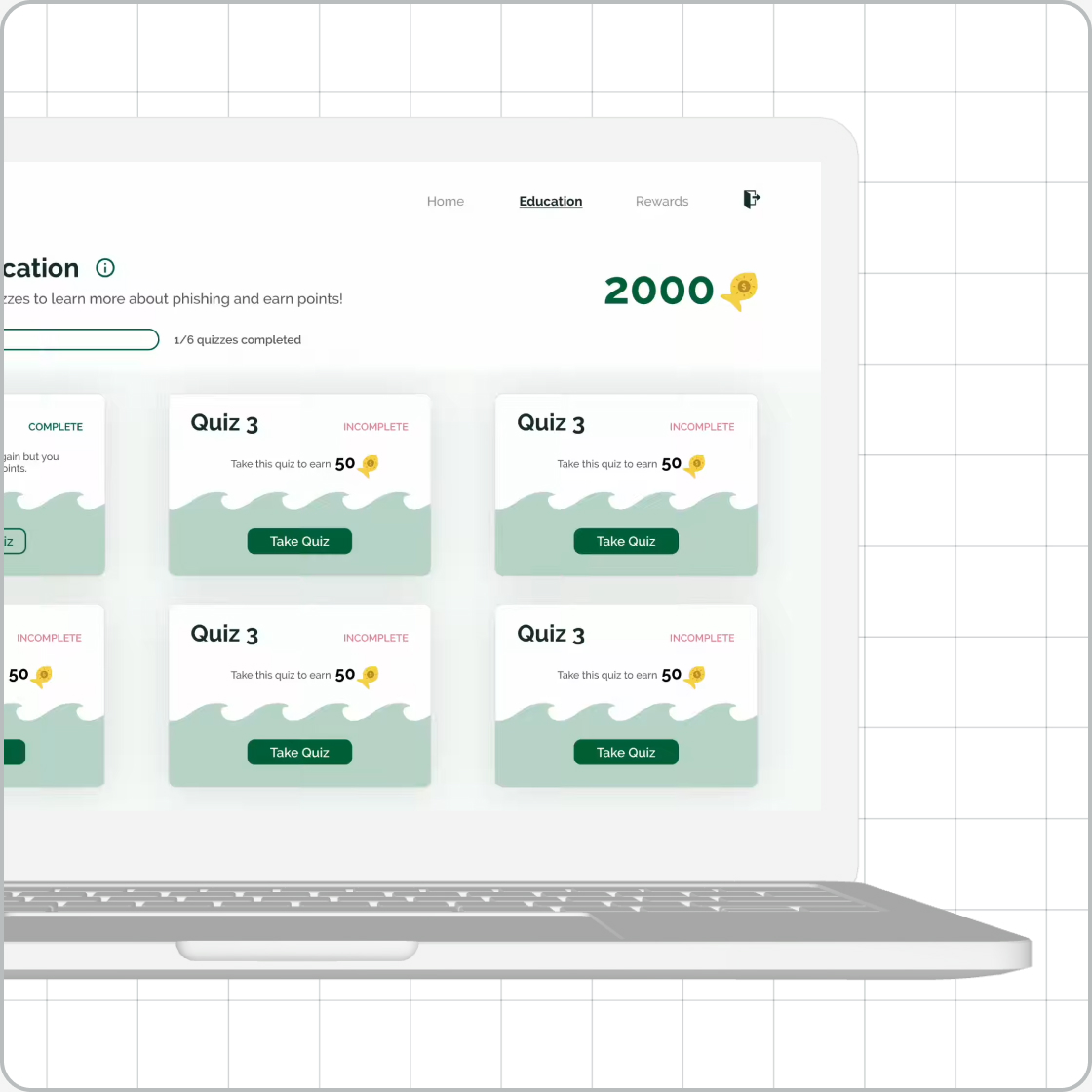
GoPhishUX/UI • Student work
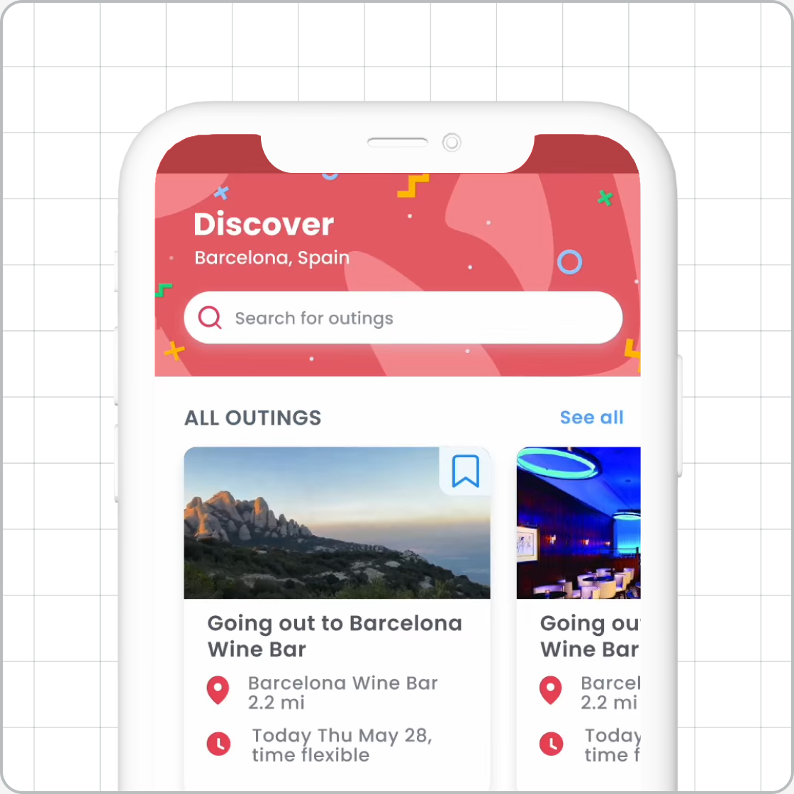
The Imagination StationExperience design • Student work
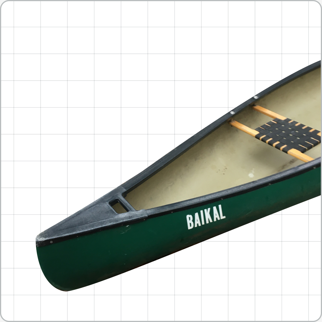
RescanoeProduct design • Student work
UnioUX/UI • Student work