Unio
Helping students studying abroad build a social network in order to have fun and stay safe
CHALLENGE
As a final project for Introduction to UX/UI Design, my partner Joy and I were tasked with a 2 week sprint to create an original app concept. We started with the prompt "Create a digital solution to combat loneliness in a hyperconnected world," and from there narrowed our problem space to students experiencing isolation on their study abroad trips.
This isn't one of the bigger projects I've worked on, but I think it highlights my thought process really well!
OUTCOME
- We spent 2 weeks discovering pain points, brainstorming solutions, prototyping, and iterating on our designs to create 30 hi-fi mockups of an original app concept.
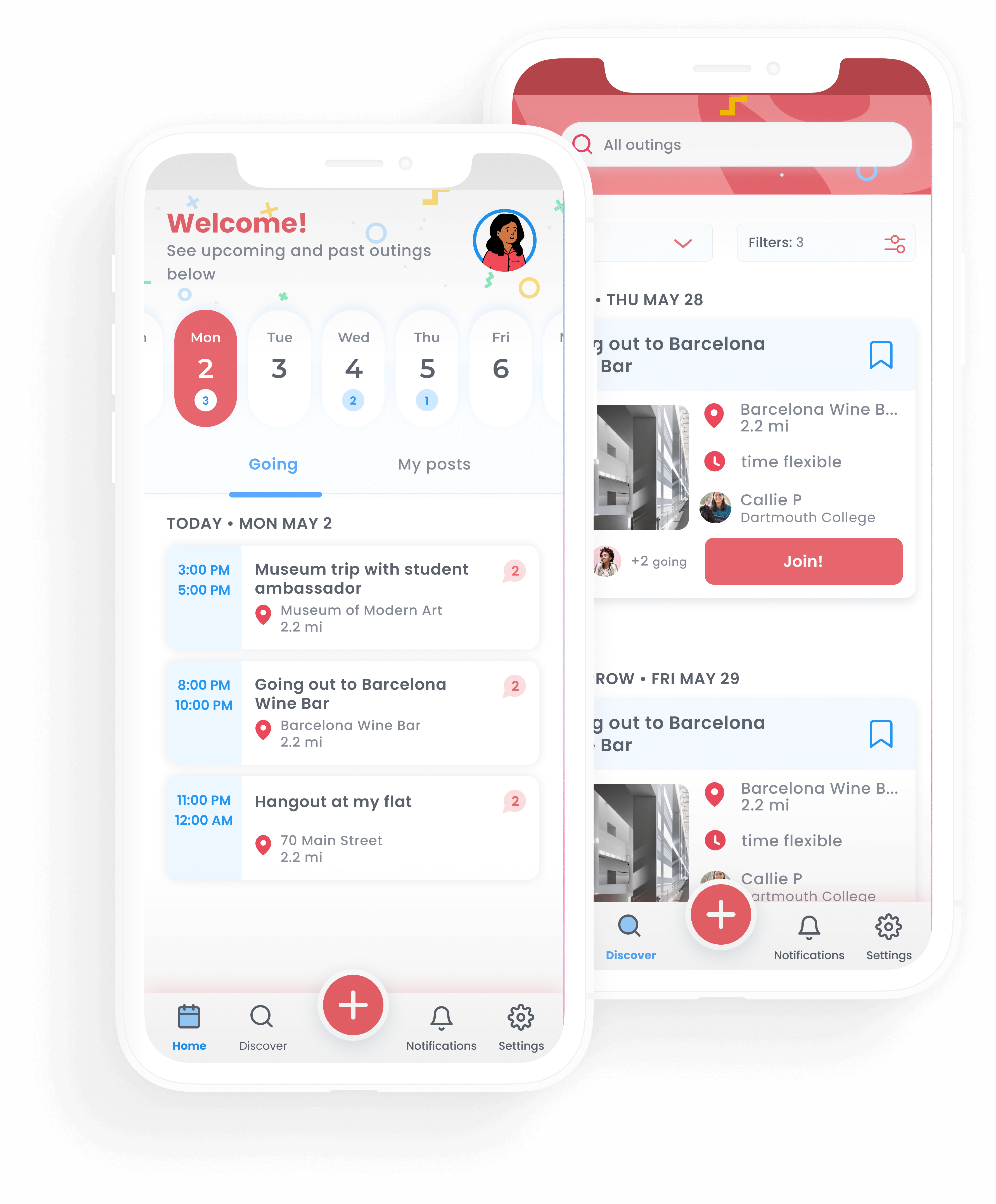
- Unio is a meetup app for college students to plan outings and meet new friends while studying abroad.
- Rather than creating “bubbles” of Americans abroad, Unio also facilitates connections to student ambassadors from local universities
PROJECT INFO
Team
Me (designer)
Joy Miao (designer)
Skills
Needfinding
Brainstorming
User research
Prototyping
Styling & brand identity
Timeline
2.5 week sprint (2020)
RESEARCH & NEEDFINDING
“Create a digital solution to combat loneliness in a hyperconnected world”
This was the prompt that we started with, but we knew we had to narrow our scope. We started by conducting interviews, attempting to discover when, where, and why people feel lonely. Interestingly, we heard a common theme from several interviewees: study abroads can be extremely isolating. It’s difficult to be away from home, especially when students are apart from their usual social networks. Those without a structured abroad program spent lots of time exploring by themselves.
Identity can also play a big role during the abroad experience. Female, nonbinary, queer, or POC students often felt less comfortable going places alone in an unfamiliar city, not knowing whether they would be safe. This can led to their loneliness being compounded, and made them feel like they weren’t making the most of their trip.
To empathize with our users, we mapped their experiences with design methods like empathy maps, journey maps, stakeholder maps, and personas.
Sarah, 20
- Junior in college studying Art History and Spanish
- Abroad in Barcelona for 3 months
- There’s only 3 other students from her school on the exchange program, and she doesn’t know them very well
- Tried going to a bar by herself once, but it felt sketchy
- Is now spending more time in her room than she would like
HOW MIGHT WE?
How might we help students feel safer and have fun while abroad?
DESIGN PRINCIPLES
#1
Designing for trust
Above all else, we needed to make sure our users would feel secure using our solution and let them know that we have their best interests in mind.
#2
Convenience and simplicity
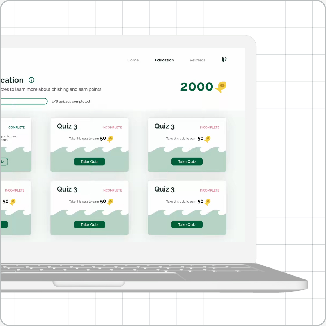
We needed to make sure our solution would fit seamlessly into the lives of our target population. It’s hard to convince college students to add anything new to their plates (see the GoPhish case study for more proof), but making it as convenient as possible would help.
#3
Fun and playful energy
Studying abroad is supposed to be a time for adventure and fun, so we didn’t want to take our solution too seriously. A more lighthearted tone seemed like the best fit for our youthful audience.
IDEATION
With our main question and design principles guiding us, Joy and I started by getting lots of quick ideas down on paper. We liked the idea of connecting students to go to events or places, which could create groups around common interests and bring safety in numbers.
Some favorite initial ideas:
- Group forming/event organizing
- Browsing nearby places and events
- Connecting visiting students with local students
- “Reviews” of certain places
- Country specific emergency/SOS resources
SKETCHES & LO-FI WIREFRAMES
DESIGN CHALLENGE 1
Avoiding "feature creep"
We started off with lots of ideas and, at first, tried incorporating them all into one app. But returning to our users helped us realize that many features were unnecessary and unwanted, helping us to refocus on the core concept of a meetup app.
Validating our ideas led to a more streamlined product that our users responded positively to.
DESIGN CHALLENGE 2
Helping users feel safe
Our core concept is safety in numbers. By organizing group outings, students don’t have to risk going places alone. But we had to take it further than that - how could we ensure that meeting up with groups of strangers would be safe for users?
Through testing, we realized that we had to limit the user base of this app. Interviewees were concerned that “random older people” (in the words of one student) on the app would be “creepy.”
For those reasons, verification with a student email address is required for registration. Visible user profiles and the ability to report suspicious accounts increases accountability.
DESIGN CHALLENGE 3
Social elements
The mission of this app is to facilitate in-person connections and adventures, and we didn’t want it to turn it into another social media app.
At first we had no social aspect, hoping this would encourage users to meet as many new people as possible. But a tester pointed out that this goes against our goal of creating friendships, and we shouldn’t stand in the way of repeat connections.
DESIGN CHALLENGE 4
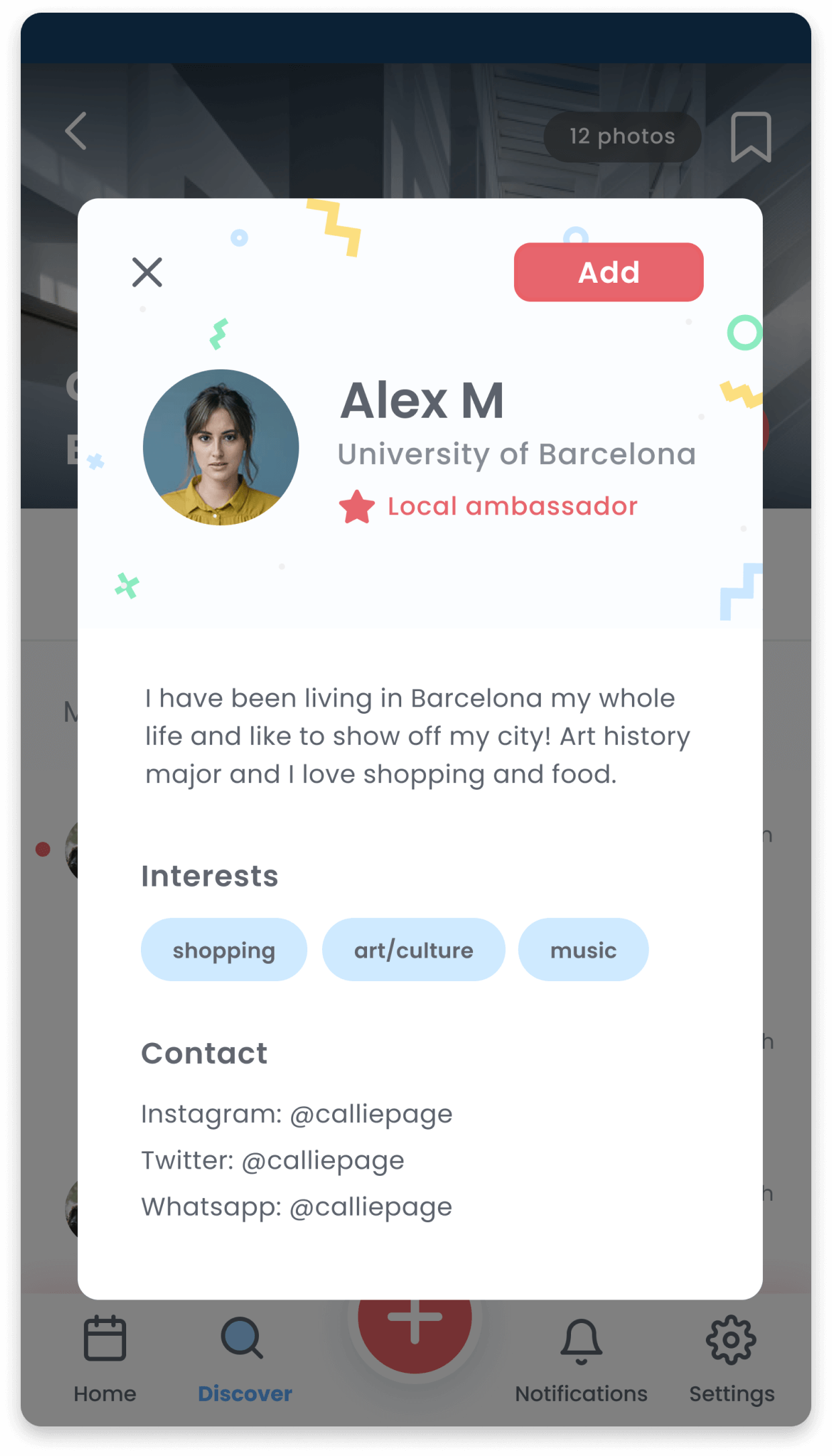
Popping the bubble
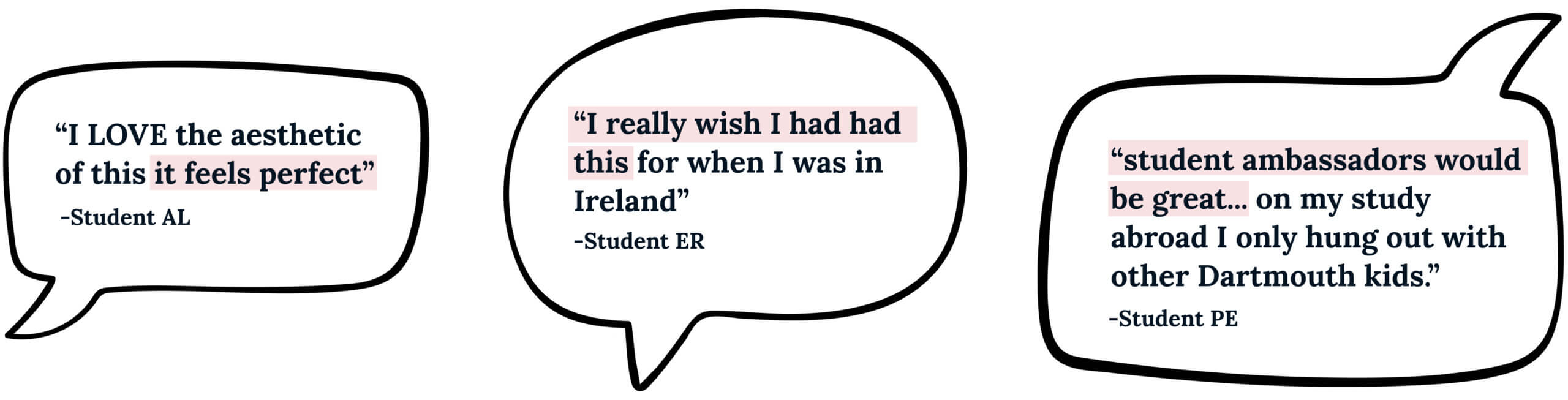
One of my interviewees mentioned that her favorite aspect of her study abroad in Argentina was the opportunity to befriend local students through an ambassador program. These new friends had an insider perspective and could show her the city hotspots... But most study abroads don’t offer this opportunity.
We were afraid this app would result Americans only hanging out with each other, but this interview showed me a solution. By adding a similar in-app ambassador program with local volunteers organizing events, we could pop the bubble.
DESIGN CHALLENGE 5
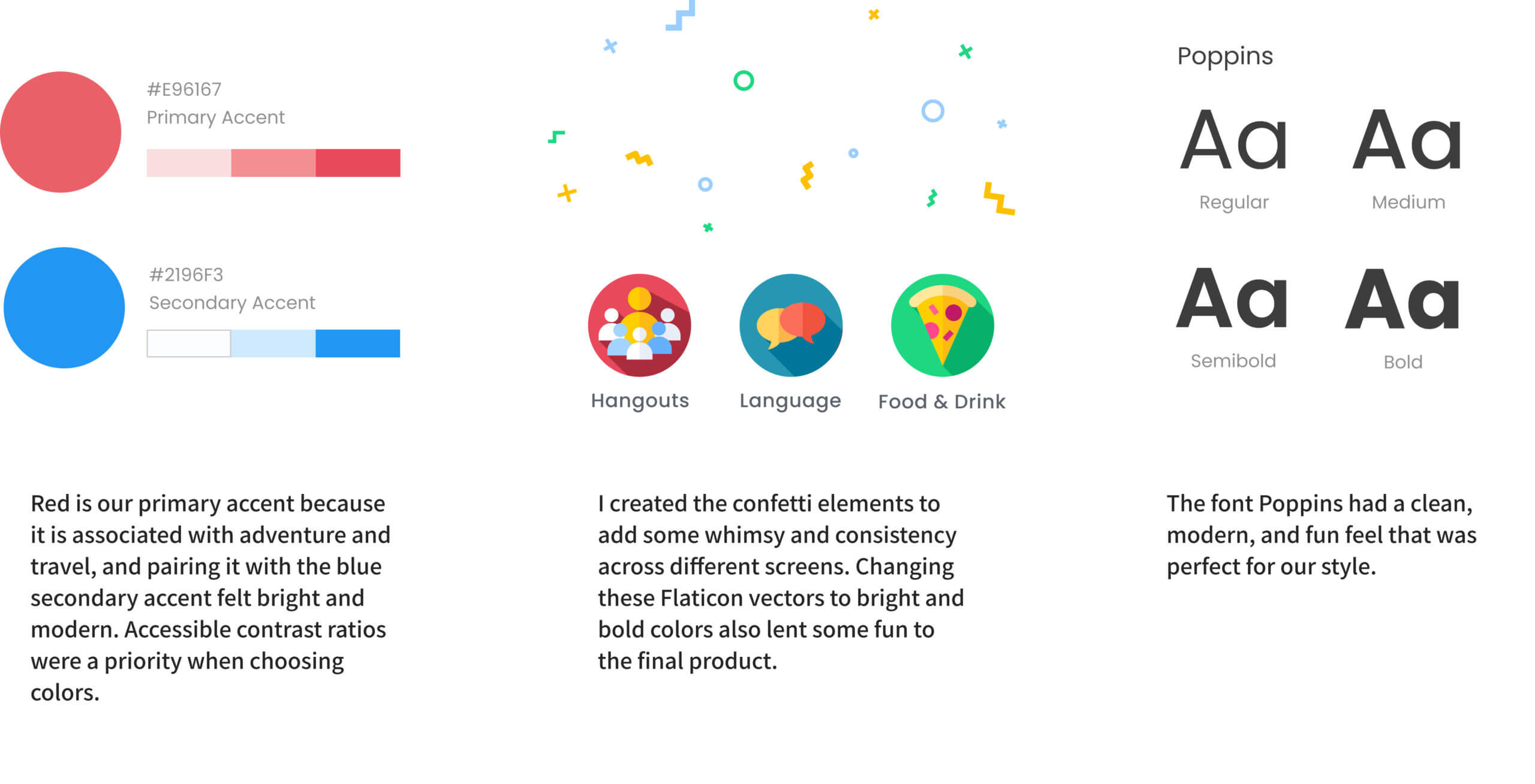
Styling and branding
We wanted to create an original style guide that reflected the fun and playful nature of our app while prioritizing accessibility.
FINAL SOLUTION
I created this video to highlight Unio's features and demonstrate how it can help students studying abroad
USER FEEDBACK
TAKEAWAYS & NEXT STEPS
#1
More research and testing on the ambassador program
One area we might want to test more extensively is the ambassador program. Even if there is a precedent for these kinds of programs, due to the limited timeframe we didn't speak students from schools abroad to ask if they would be interested. But in my opinion this app could be harmful without the inclusion of intentional opportunities for culture exchange, and I would want to re-examine the designs if this feature tests poorly.
#2
Hitting on a geniune need was the most rewarding part
One of the most rewarding parts of this project was solving a real problem. It would have been easy to design an app that looks pretty but no one would use, which is why deferring to the users and deconstructing the problem space was the real "meat" of this project.
#3
Diverge, converge, diverge
We started by brainstorming a ton of ideas, which of course is a necessary (and fun!) step in the process. But I learned that trying to fit too many of those ideas into one solution isn't the best approach - by reducing our product to a core concept, validating that concept, and then adding additional features based on the needs of the users (rather than adding the ones we liked), we created a stronger solution in the end.

NCSECU StorefrontUX/UI • Client work
FlourishUX/UI • Student work
TD WealthUX/UI • Client work
Magellan EAP AppUX/UI • Client work
GoPhishUX/UI • Student work
The Imagination StationExperience design • Student work
RescanoeProduct design • Student work