NCSECU Storefront
Redesigning the digital front door to the second-largest credit union in the United States.
CHALLENGE
With 2.6 million members and $53 billion in assets, the North Carolina State Employee’s Credit Union is the second largest credit union in the US. They are known for their excellent in-person customer experience, but their web presence was lagging behind.
Our task was to refresh their pre-login web experience - where users browse products, compare rates, and learn more about what it means to join the credit union. We needed to design a custom core experience based on user research and testing, but also create some consistent templates that the NCSECU design team could use on their own.
OUTCOME
- We designed 74 screens (mobile + desktop combined)
- I created a fully responsive design kit of autolayout components using updated brand styles for use by the NCSECU design team
- NCSECU moved into a follow-on development project with our firm
PROJECT INFO
Team
Me (lead UX designer + visual design)
Steve Brown (project leader)
Brandon Comstock (project leader)
Lauren McAuliffe (visual design)
Andrew Klein (visual design)
Constante Quirino (content)
Bella Jiang (content)
Christina Lepre (project manager)
Lauren Brown (research)
Shea Liles (NCSECU designer)
Brandon Batten (NCSECU designer)
Mary John Caldwell (NCSECU designer)
Laura Wallenta (NCSECU content strategist)
Skills
Client collaboration
Wireframing & rapid iteration
Visual design
Design system creation
Timeline
6 months (2022-2023)
RESEARCH FINDINGS
User research - main areas for improvement
I conducted a heuristics review of the current site and took notes for 10 research sessions moderated by Lauren, who interviewed both potential customers and current NCSECU members about their experience on the site.
#1
Users need to be able to compare products and rates more easily
Users struggled with the navigation structure. If they don’t know exactly which product they want, they have to click on every page rather than navigating to a single category overview page.
Additionally, mortgages are NCSECU’s most important product, but for each home loan type users have to calculate the rates individually. This made comparison across offerings difficult.
#2
The site needs to provide prospects with a clearer path to join and better highlight the value of being a member
Many people we interviewed didn’t even know they were eligible to join. The membership requirements page lived in the footer, and even those who knew they could join didn’t know where they should go to start the application process.
Some didn’t know the difference between a credit union and a bank, and how NCSECU can offer better rates since they are a not-for-profit institution. Not highlighting this value proposition was losing them potential members.

#3
There’s an opportunity to provide more learning resources
Less financially experienced users weren’t sure where to start. The website outlines the product features of each, but doesn’t give much guidance.
For an experience that would reflect the warm in-branch service that NCSECU is known for, we thought the site should provide information about financial topics that isn’t just an upsell.
END RESULT
Final mobile app prototype
I created these high-fidelity designs and prototyped them in Figma to faciliate communication with Magellan stakeholders and technologists. The MVP generated positive feedback and Magellan is taking the next steps towards development.
Updated homepage
The homepage provides a more scannable overview of SECU’s value proposition and key offerings. For those unfamiliar with credit unions, community testimonials and statistics help build credibility.
“How can we help you” navigation
For those who don’t quite know what they need yet, these modules on the homepage and mortgage page help users narrow their search more gradually.
Category pages with comparison cards and charts
Rather than forcing the user to click between specific products, the category pages provide a preview of features and rates.
New Join page for prospects
The membership criteria and steps to join are outlined in a scannable format. Featuring SECU’s history and FAQs help those unfamiliar with credit unions learn the potential benefits.
New Learning Hub for less experienced members
Related education articles are featured at the bottom of product pages, providing guidance to those who aren’t sure what they need. The goal was to convey a helpful tone that mirror’s NCSECU’s famously friendly in-branch customer experience.
Robust design kit with new styles and responsive components
I made sure to maintain an organized design system that would serve as the source of truth for spacing, colors, typography, and repeated components. With so many people collaborating on this project, it proved to be absolutely essential.
When Marketing requested that a style be tweaked or new copy came in from the content strategists, I could make changes that would flow across all 74 screens. We could also build mobile layouts almost instantly with component variants.
DESIGN PROCESS
Some key UX challenges and how I helped solve them
This was my first time designing a content-heavy marketing website. Even with so many pages to work through, I made sure that the user experience didn’t take a backseat. I took the lead on UX iterations, with help from Steve and the NCSECU team.

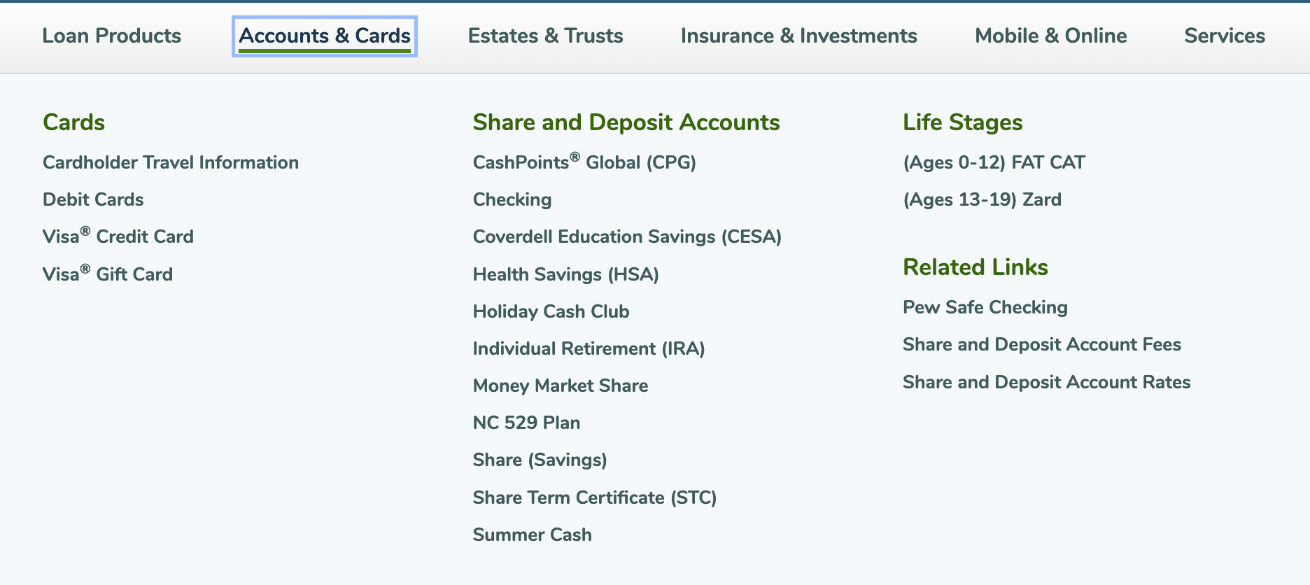
Typical large menu dropdown
Users struggled with the naming of products - they were too specific, and sometimes misleading. For example “Mortgage Loan Toolkit” is a very specialized product, but many users clicked on it expecting something for them.
Unfortunately due to stakeholder considerations, we didn’t have approval to rename products.
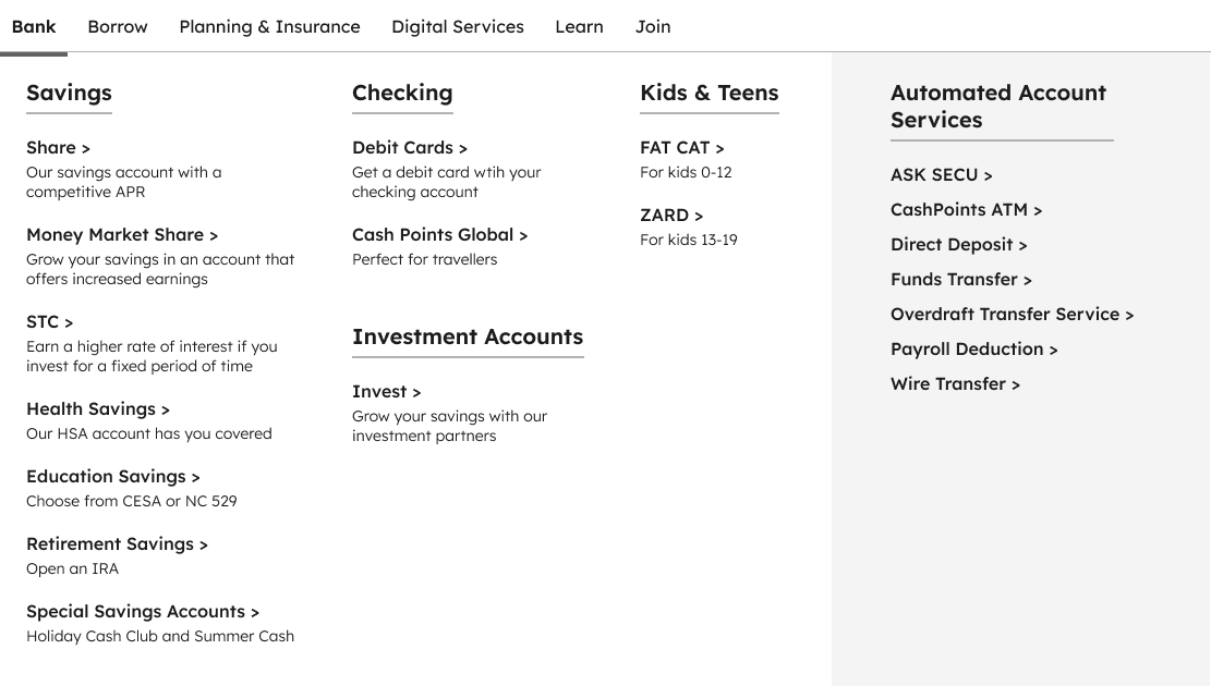
Reorganized navigation with helper text
To get around the inability to rename products, Constante and I regrouped them under friendlier headings. “Bank” was clearer to users than “Accounts & Cards.” I also added some text that would hopefully set expectations before they click into the page.
I liked that the reorganized navigation menu gave more context, but there was too much text for easy scanning.
Sequential navigation with helper text
I created this dynamic navigation menu that would let users narrow down their search more gradually. Even though there’s an extra step, we decided the more scannable menu is worth the tradeoff.
CHALLENGE 1
Website navigation
Navigation was challenging because our project did not have approval from SECU stakeholders to change product names, which were confusing to users during testing.
Working within this constraint, I was able to design a navigation menu that provided clarifying context without becoming too cluttered.
CHALLENGE 2
Loan comparison tool
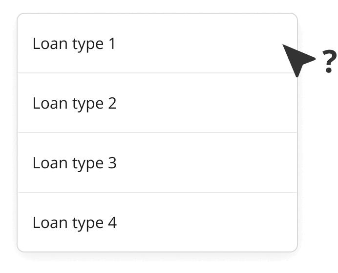
Comparing loan rates is a key user goal for this site, and we wanted to make the experience accessible to all levels of financial literacy.
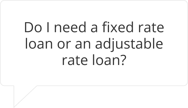
I designed a table to showcase NCSECU’s core home loan offerings - Adjustable Rate, Fixed Rate, and HELOC loans. Balancing technical feasibility and ease of use led to a customizable rate table that enables comparison across mortgage types.
User must know their Loan to Value, and cannot compare across loan types
NCSECU has different rates for different Loan to Value ratios (which is just Loan Amount/Home Value), but not everyone knew what this meant and weren’t sure which to choose.
Additionally, the user has to click across different product offerings rather than viewing adjustable rates or fixed rates side-by-side.
Integration of rate calculator and comparison table is perhaps ideal, but not feasible
I proposed an experience that would let users input their home value and loan amount and receive their customized rates/payments in one place.
We learned that for business reasons NCSECU would be depreciating their existing calculators and instead license a third-party calculator service. Even though we liked the UX, this high level of integration would not be technically feasible.
Simpler comparison table, with only relevant rates shown
The burden is no longer on the user to know a confusing financial term, instead they can input their home value and loan amount so that the Loan to Value is automatically calculated and relevant rates displayed. If the user doesn’t know their numbers yet, the table defaults to the most common LTV. They can also see how rates differ across loan types.
Removing the integrated payment calculator makes this table technically feasible, and the link to NCSECU’s third-party calculator is featured prominently.
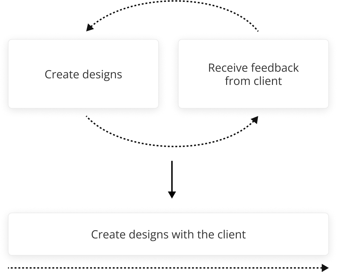
The usual workflow for getting feedback from the client was not collaborative enough
NCSECU has a team of designers and a content strategist who needed to be included in the process. Knowing that styles and content might be altered along the way, I planned for a more flexible designs with Figma styles and components.
Robust use of style libraries, autolayout components
All colors, typography and grids were maintained in Figma and applied across all screens.
Recurring items like banners, heroes, form elements, teasers were all built out as components with both desktop and mobile variants. This was key to delivering mobile layouts, as copy can be maintained across variants.
Content components enable copy to be updated across all instances
Many recurring links and article teasers needed titles and descriptions that were added later. To ensure consistency, I used a nested component system that would allow accurate copy to flow across all screens.
CHALLENGE 3
Design process and collaboration
This challenge is a little different from the others, as it came out of the design process itself. NCSECU had specifically requested high levels of collaboration when signing on, and our usual procedure for client feedback wouldn’t suffice.
In addition to a Figma library of consistent styles and components, I implemented a system for content management that would allow content updates to occur at the same time as design updates.
TAKEAWAYS
#1
Constraints can enable creativity
Technical and business limitations meant that we sometimes had to generate different options. With creativity, t’s still possible to maintain good UX as a north star.
#2
Closer client collaboration is possible with planning
This level of client collaboration was new to me, and despite the added complexity I was able to alleviate some pain points by making the most of Figma.
#3
User experience doesn’t have to suffer for the sake of marketing
Luckily NCSECU wanted to create a good experience for their users, not just increase profits. We were able to suggest features that would feature their products and improve SEO without burdening users.
#4
I hope to incorporate more testing in future projects
We we able to do some initial user research and tree testing of navigation to validate our assumptions, but weren’t scoped for extensive usability testing of the site. I would have hoped to do testing with actual designs and content, and passed this recommendation to NCSECU.
FlourishUX/UI • Student work
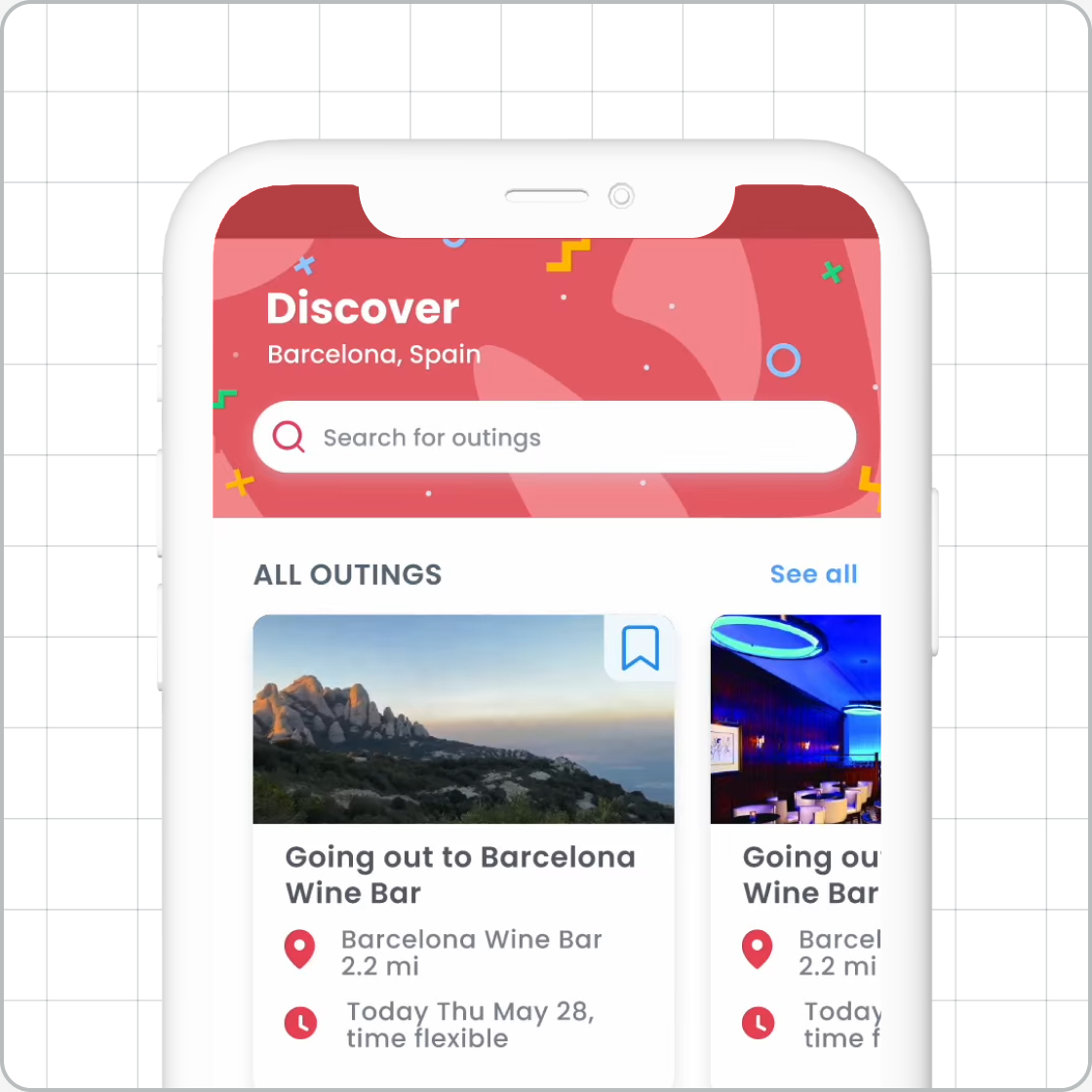
TD WealthUX/UI • Client work
Magellan EAP AppUX/UI • Client work
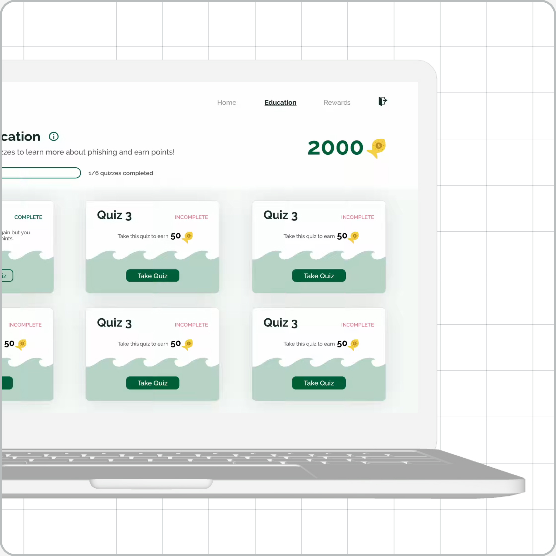
GoPhishUX/UI • Student work
The Imagination StationExperience design • Student work
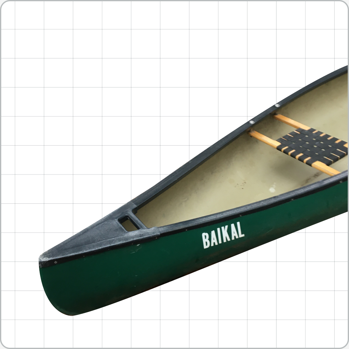
RescanoeProduct design • Student work
UnioUX/UI • Student work